Showing posts with label Stamping. Show all posts

Monday, May 6, 2019

6:00 AM

Japanese Cherry Blossom Nail Art in 4 Easy Steps


     Have you ever sat down to paint your nails and had the end result be completely different than your original idea? That's just what happened to me when I created this Japanese Cherry Blossom look. I've actually wanted to do a manicure like this for quite some time but just never seemed to get around to it. I've either had other ideas come first or just haven't been inspired to sit down and actually create it. 

     Now I could get all philosophical and say that fate stepped in and in its way pushed me to finally create this nail art but I think it was more of a case of being inspired by the colors that I used.

     Back in February I rushed out to Walmart to find the latest core colors from Sinful Colors and have had them sitting on my desk ever since. We all know by now that I have a habit of doing this and I'm really trying to get better about it but old habits are hard to break I guess. Anyway, I've been looking at Violet Riot and Strike a Pose for months thinking that they would look great in a gradient. Which I finally put to the test last week and I was right. They go together beautifully. So beautifully in fact that they created a canvas that just begged to have nail art applied. And that is how my 4-step Cherry Blossom nail art was created. 
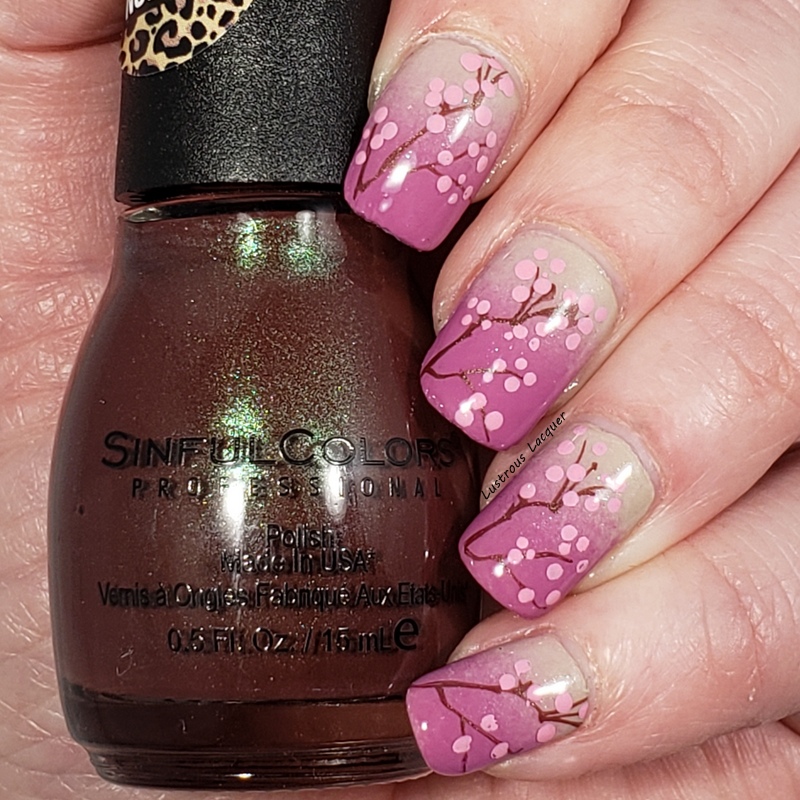

     Step 1: Paint a layer of Sinful colors Strike a Pose and let dry. This doesn't have to be a thick layer or even have full opacity since we will be doing a gradient over it. You just want to get a layer down so that you'll have better coverage on the gradient. 

     Step 2: Crate the gradient using Strike A Pose and Violet Riot. I like to use a sponge to create my gradients because I tend to get a better blend of the colors but you can do yours however you're comfortable. (The one I use is from Born Pretty Store and if you use code LAUNX31 you can receive 10% off your order.) Remember to use a liquid latex barrier around your cuticles to cut down on clean up. If you don't have liquid latex or are allergic you can always use scotch tape. Add a layer of topcoat and allow to dry fully. 
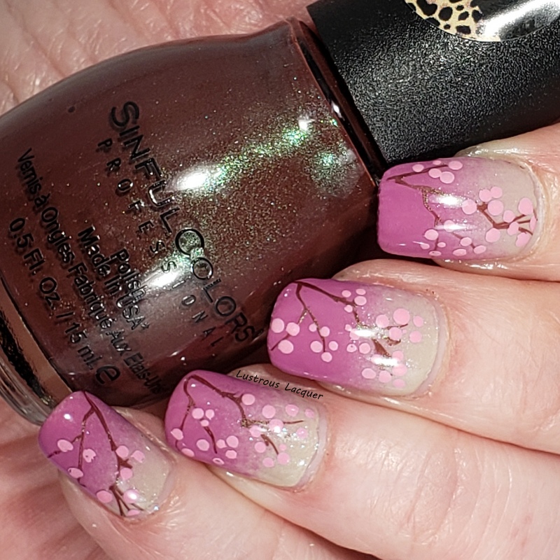

     Step 3: Stamp your desired image onto the nail. I used Clear Jelly Stamper plate Cjs-05 and Sinful Colors Body Language from the Naughty Nudes collection to create my branches. 

     Step 4: Using a small dotting tool you can create the blossoms. I used the smallest of my dotting tools and Hit the Bottle Drunk Tank Pink to create mine. I randomly placed dots along the branches and in bunches on my nails. Another layer of glossy topcoat and you're all done. 


     I've also included a step by step video tutorial for those of you who like to see how manicures are done. 


     And there you have it. My 4 easy steps to create a Japanese Cherry Blossom manicure. Pretty simple right? I actually loved how this turned out and didn't want to take it off. But like all nail bloggers know, the switching must go on and I was only able to wear this for about 8 hrs. 

    Have you ever had a manicure just sort of come together as you were doing it? Does your base color ever inspire your nail art? Let me know in the comments. Thanks for Stopping by and Happy Polishing! 


Thursday, September 27, 2018

6:00 AM

Lustrous Lacquer's Quarterly Favorites Round-up Vol. 3


    It's time for the third installment of my quarterly round-up. I hope you enjoy this look back at the previous 3 months as I do. I've decided to shake things up a bit this time around and share more than just my favorite nail art looks.  Mainly because there are so many things that inspire me, teach me and shape who I am as a blogger and I feel they are worth sharing. Plus I feel that it's nice to get to know a little about the person behind the blog. I know I'm more likely to leave a meaningful comment or even just search out the latest blog post if I feel like I know the person behind the screen a little bit. 

     In July I continued my quest to get through my polish collection and found myself reaching more for older polishes while also sharing the new Wild at Heart Collection from Sinful Colors. It was a slow month for nail art with only 3 looks but they are looks that I really loved. It was hard to narrow down a favorite but I decided on the look I created for the 4th of July.


     I revisited an old technique to create this look while still following the fluid nail art trend and was very pleased with the results. If you want to see my second favorite look from the month check out my Dichotomy post from 1850 Lacquer.  Dichotomy is a thermal polish and I added an accent nail that has a "disappearing" image on it.

     In July I decided to try and take my blog to the next level and see if I could make a small income with a few affiliates. You may have noticed the addition of a few banners in my sidebar, if not take a look and see if there's anything that catches your eye. I've got the ever so popular Born Pretty and Beauty Big Bang banners that people are familiar with. And then I got lucky and was able to become an affiliate with Sally Beauty Supply and Planet Beauty.  I'm not looking to be able to quit my day job but it would be nice to make enough to be able to pay for my blog fee's from it. And a girl can always dream, can't she?

    August saw a new opportunity for me when I joined the Nail Challenge Collaborative group on Facebook. I know art is supposed to be personal and come from the artist's heart but sometimes it's nice to be given a direction. The direction I was given for August was simply Pink and Blue. That inspired my first ever manicure using Sharpie Markers.


    My daughter also got to share her nails on my blog again with her baseball inspired look. She was so happy about this post and checked my site every day for weeks just to see if her post was still in the top spot on my popular posts list. I should probably thank her for all those page views.

     In August, I discovered Naio Nails on Youtube and have become fascinated with the nails that she creates. They are generally over the top and completely inappropriate for my lifestyle but I love them. And I feel like I've picked up a few things that will help my skills.

     September saw me heading back to work and ended up being a slow month for nail art. I only shared one look with you, but it's my favorite one in this round-up. My stone marble nails not only made me proud but actually turned out the way I pictured them.


     I am hoping to have more fun looks to share with you in October, including some techniques that I have never tried or haven't used in years.  Do you ever go back and revisit old techniques? What trends do you wish would come back? Thanks for stopping by and Happy Polishing!
Tuesday, September 4, 2018

6:00 AM

Untried A-Z Challenge - Letter R


    I'm back this week with another installment of the Untried A-Z Challenge. This is a laid back challenge where every other week a new letter is chosen and you swatch a polish that starts with that letter. You can go by brand name or polish name, do one polish or a few, share a plain swatch or add nail it. It really is up to you with what you share and how often you join in. 


     This week bring us to the 18th week of the challenge and as you may have already guessed, the letter R. For the letter F I shared with you 2 polishes from KBShimmer and will be revisiting the brand again. This week I've gone with a not completely untried polish, but one that I have yet to actually wear, Run! It's the Coppers!

   
Copper colored linear holographic nail polish

     Released in 2014 as part of the Early Summer Collection, when this perfectly copper colored linear holographic nail polish arrived at my door I immediately painted one nail so I could bask in all its beauty. Sadly that was it for this polish and it was tucked away in my helmer, collecting dust until I pulled it out again 4 years later. I know, I know, I have hung my head in shame over this. 


     The application was an effortless experience. The formula is one of the best I've worked with allowing for the polish to flow evenly from the brush onto the nail with complete control. I did notice a slight VNL after the first coat and a second coat achieved full opacity.

     I did notice minimal brushstrokes once the polish dried but I had to really look for them. In fact, my camera picked them up more than what my eyes actually did.


      I really like this color, but it's a bit much for a full manicure even for me. I'd love it as an accent nail but ended up using it as a base for some Autumnal nail art.


     Now, this didn't turn out quite like I had envisioned but that's partly because I had to switch tactics in the middle of it. I thought I had a specific image for stamping but I was wrong and ended up going with an image that I'd consider a distant cousin of my original idea. 

     This image is from the Totally Negative 02 plate from Lina and while it still looks a little like leaves, it falls short of what I wanted. The gradient I did using another KBShimmer polish called Oh My Ganache from the 2016 Fall Collection and Run! It's the Coppers!

     I absolutely love the accent nail however and am quite proud of how it turned out. I decided to dust off my freehand skills and painted the tree with acrylic paint. Seeing the success I had with this has inspired me to try more freehand looks and will have another one to share with you next Tuesday. Or if you just can't wait until then I shared a teaser pic on my Facebook page. In the meantime be sure to check out the other polishes in the challenge this week and as always, Thanks for stopping by and Happy Polishing!

Thursday, August 30, 2018

6:00 AM

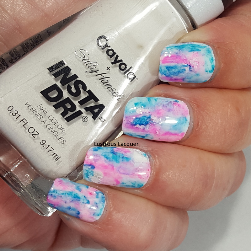
The Nail Challenge Collaborative presents Pink and Blue


     I recently joined the facebook group Nail Art Collaborative. The Nail Challenge Collaborative is a monthly nail art challenge group free for anyone to join! Each month there is a new theme and the members create 2-4 manis and share with the rest of the group. Even though I've only been a member for two weeks I've been anxious to join in on the fun. The theme for the month of August is Pink & Blue and while I only had time to do one mani, It's one that I really like.


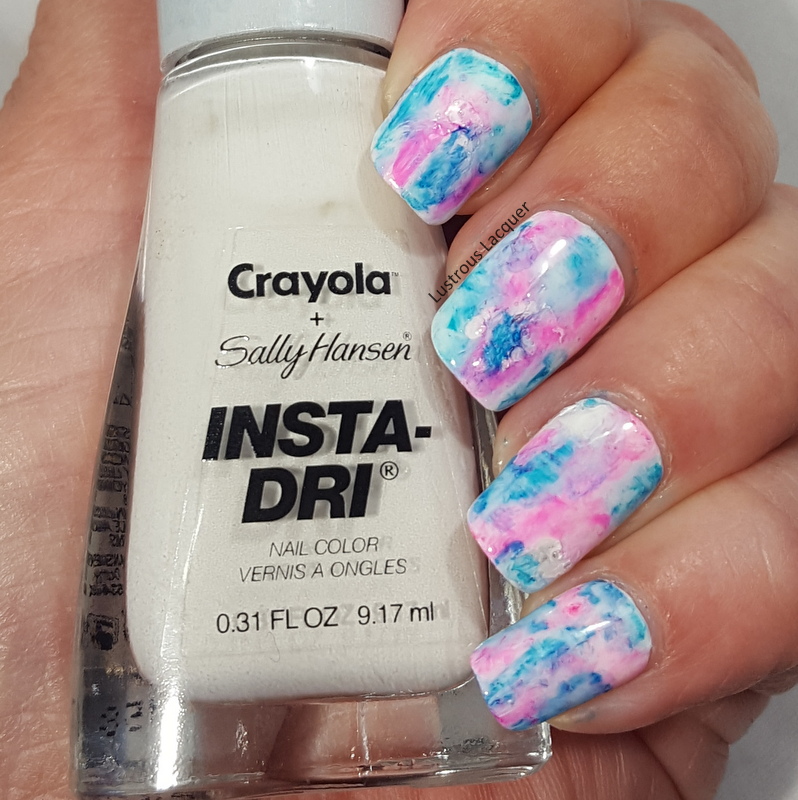
    I started with a base of White from the Sally Hansen Insta-Dri Crayola collab. This is a seriously great white. It covers evenly and had minimal streaking. I know a lot of whites start out awesome and then get goopy as you use them, I'm hoping that's not the case with this one.

     After letting the polish dry completely I added a glossy top coat for strength, and then a matte top coat so the sharpies had something to stick to.


    To create the marbled effect I randomly drew patches on my nails with sharpie markers. I went one nail at a time since I didn't know how quickly the marker would dry. Once I was happy with the patches I dipped a nail art brush into acetone and dabbed it onto the nails which caused the marker to spread and bleed. At first, I tried rubbing alcohol but it didn't seem to have any effect on the marker. That could be because my bottle of rubbing alcohol is only 50%.

     You can repeat this step until you get the look that you like, just remember to let the acetone evaporate off your nails completely before going back in with the sharpie. I was a little impatient and found out the hard way that even a small amount of acetone will dry out your sharpie.


   I really like the way this turned out but as I looked at it I had the strong urge to add some nail art. Nothing too extravagant, I didn't want to take away from the marble base.


     I decided to add some subtle stamping using image plate Creative shop 96 and China Glaze Intelligence, Integrity and Courage and Cosmic Dust as an accent.


     I really expected Cosmic Dust to be a bit darker and was hoping it would stand out more to be a truer accent. I guess when applied thinly like in stamping form it lightens up a bit. The hint of sparkle does add a little something and it isn't over the top like I was wanting.


    What do you think of this sharpie marbled look? Do you like it better with or without the stamping? I had a ton of fun creating this for the August prompt and can't wait to see what the September prompt is. Make sure to check out the other looks from the talented ladies in the group and be sure to stop back next Tuesday for letter R week in the Untried A-Z Challenge. Thanks for stopping by and Happy Polishing!


Tuesday, July 17, 2018

6:00 AM

1850 Polish - Dichotomy


     Ever since their debut in December of 2017 1850 Artisan polish has been taking the indie world by storm. While there have been several memorable releases including a stunning topper collection packed with flakies, today I'll be showing you one of the original polishes, Dichotomy.

     Dichotomy is scattered holographic thermal polish that shifts from a deep purple when cold to a pale lilac when warm. 


     The application is absolutely luxurious with a super smooth formula and a much higher opacity than expected. When applied the color is in the cold state and appeared to have full opacity after the first coat. I used two coats to make sure of full opacity no matter what stage this polish was in. Shown here is two coats plus top coat. 


    For the accent nail, I wanted a stamped image that seemed to appear and disappear depending on the temperature. I used Sinful Colors Forbitten Fruit and an image from Creative shop 23. Forbitten Fruit isn't an exact match but it wasn't as obvious in the cold state as my camera shows. 


    I absolutely loved wearing this manicure and got a kick out of people noticing that it changed colors. I wore this for a full week wild I was camping and came home with only minimal chipping and tip wear. For the conditions I put my hands through that week, I'm very impressed with this polish.  

      How do you feel about thermal manicures with "disappearing" designs? Have you tried this brand yet? I also picked up Duplicity which is another thermal polish and can't wait to try it. Be sure to stop back on Thursday for my review on Sparrow from Poetry Cowgirl, until then, Thanks for stopping by and Happy Polishing! 

Thursday, July 12, 2018

6:00 AM

Gradiated Foliage Nail Art


    I think it's about time I show a little nail art around here, how about you? I know we all like to see swatches of pretty colors but nail art is what really drives me. For today I've gone for a look inspired by my recent camping trip and all the green trees that surrounded us. And will be surrounding us again this weekend as I head out for another adventure. I've gotten my camper all cleaned out since my last post and now I've moved on to packing it up.


      I started with a base of Color Club Super Natural from the newly released Halo Hues collection found at Walmart. For my gradient, I used Lemming Lacquer You're Standing on My Neck which was released in the Polish Pick Up 1990's theme from May of this year and Color Club Super Natural.


    The original look had Super Natural going all the way to my tips, which looked nice. At the last minute, I sponged a bit of You're Standing on My Neck to the tip of my ring finger as an accent. AS soon as I did that I knew I wanted the rest of my nails that way.


     I really like the way Super Natural gives an illuminated effect to the center of the design. It's almost as if the sunlight is reflecting off the center of the leaves. 


    The stamping I did with Hot the Bottle A Glint of Gold and Creative Shop plate #96. I actually had three other colors picked out to stamp with. Black, White, and Silver. But I quickly put those aside for the gold and I think I made the right choice. The black and white would have been too harsh and the silver too subtle. What do you think, did I make the right color choice for my stamping?


    And because I have the need to matte everything these days I had to show you both versions. MY go to matte top coat is currently Matterial Girl from Blush Lacquer. Which I happened to help name. It's my first time naming a polish and I'm still a bit giddy about it!


    So which version do you like better, glassy or matte? Have you found the Halo hues collection this year and are you thinking about picking up a few colors? I've got to get back to packing but Thanks for stopping by and Happy Polishing! 


Thursday, June 28, 2018

6:00 AM

Lustrous Lacquer's Quarterly Favorites Round-up Vol. 2


      It's the end of June and that means it's time once again for a round-up of my favorite nail art looks from the last three months.  Becuase I took a bit of a hiatus for the month of May this post will be less extensive as the previous version. But that's no excuse to not sit back, relax and revisit a few of my favorite post, enjoy!


     April was a busy month for me when it came to marbled looks. I shared a drip marble and a watermarble. You'd think either one of those would have made it into my top 3 looks but I actually liked my Neutral nail art look the best. 


    This simple look had two different accent nails which is something that I don't often do, in fact, I'm not sure I've ever done it before. It was a pleasant surprise when I fell in love with it and that's why it is my favorite look from April.  

     May was the month where I lost my blogging mojo, the weather finally warmed up and so did my personal life. There are only a few posts to pick from but the one that truly stands out is my Parchment Manicure


    I am very proud of how this turned out and even more proud of the fact that I was able to film a tutorial video for my Youtube channel. I have to admit that this is my favorite manicure of the last three months, and let you know that I have a few more that I'm proud to share this summer.

     June was a stressful month for blogging because I fell behind on the Untried A-Z Challenge. Not only did I need to catch up on that but I needed to write posts to cover while I was gone on vacation. That left little time for nail art. I ended up only sharing one nail art look this month unless you count that look I created for my Letter L post. Which wasn't a nail art post specifically, but maybe I'll still count it just to make me feel better. My one and only nail art specific post for the month of June was my 80's Funky French mani


     Now I know this isn't some of my best work, and it might be considered a fail depending on my mood but it made my list of favorites for what it represents. For me, this manicure humbles and encourages me. It humbles me because even though I've been blogging about nail art for years I still make mistakes and it encourages me to keep trying those techniques I'm not comfortable with. 

    I hope you enjoyed this look back at my last three months of blogging. I'd love to know which look is your favorite. Stop back next Tuesday to see my 4th of July nail art, which I'm hosting a link up for and everyone is welcome to join if they want. The inlinkz code can be found on my Facebook page or feel free to send me an e-mail at lustrouslacquer@live.com or send me a dm asking for it. Thanks for stopping by and Happy Polishing! 


Tuesday, June 12, 2018

10:54 AM

Untried A-Z Challenge Letter L


     It was just a few days ago when I shared my letter K polish for the Untried A-Z Challenge and here it is, time for my letter L polish. I guess that's what happens when you get behind on blogging! So here is my Untried A-Z Challenge letter L polish, enjoy!


     Since it's summertime and been abnormally hot here lately I chose to go with a bright shade this week. And there's no better way to go bright than with a neon polish. Or in this case a Not Really Neon. Check out Lemonade from the Not Really Neon's Collection released last summer from Polish 'M.

Neon yellow nail polish with a creme finish

     Lemonade is a bright lemon yellow creme polish. Typically yellow is a hard color for me to wear but I actually like this one. It's so fun and bright plus it makes me look like I have a nice tan. Any polish that makes my tan look better gets bonus points from me. 

     
     Like most neons Lemonade applied a bit streaky on the first coat, thankfully it's a self-leveling polish so the streaks weren't a major issue. This polish builds up nicely on the second coat and I probably could have stopped there if I'd used white undies. I had a few places on my nails that appeared to be patchy so I opted to use 3 coats. Shown here is 3 coats plus a matte top coat. 


     Lemonade dries very quickly and with a matte finish. Just what I would expect from a neon polish. Like I mentioned above I like this polish and would probably wear it on its own in the future. But for this post, I opted to add a little nail art to the mix.


    For this marbled look, I used Creative Shop plate 31 and stamping polishes Straight Up Black and Bami White from Bundle Monster and Slate Stamping Sauce from Sassy Sauce Polish. 


    The completed look is a bit much for me but I do really like how my middle finger turned out. In this case, less is more and I'll have to keep that in mind in the future. And as you can see once again I was inpatient when applying my top coat and smeared my pinky finger terribly. 


     What are your thoughts on yellow polish? Is it a color you can easily wear? If you'd like to join in on the Untried A-Z challenge we will be staring letter M week on June 25th and ending on the 29th. Thanks for stopping by and Happy Polishing!


Thursday, May 10, 2018

6:00 AM

Parchment Manicure


     Hey Everyone, I'm back today with some nail art and a tutorial video to share with you. Yes, you read that right, I made a video! It's been so long since I've done one that I bet most of you didn't know that I had a YouTube channel. The inspiration for today's nail art was the Messy Mansions stamping plate I picked up from the March Polish Pickup Books theme. The minute that plate was in my hand I knew I wanted to do an antique paper/parchment look. And I have to say I'm very pleased with how it turned out. 


     I started out with a base of Sinful Colors Coco Bae which is a new addition to their core line for 2018. To get the aged parchment look I sponged around the edges of my nails with two shades of brown acrylic paint using the double ended sponge wand from Clear Jelly Stamper. The lighter color is Golden Brown and the Darker one is just called Brown. 


     For my lettering, I used Hit the Bottle polish The Drunken Elf and the Messy Mansions plate mentioned earlier. If you missed out that plate, any plate with lettering will work. I finished everything off with a layer of Matterial Girl from Blush Lacquer. 


     Now I will warn you this is a messy look to create so make sure to cover your cuticles with a latex barrier or similar product if you have an allergy to latex. My current favorite is the Un-Frog-gettable cuticle cover in Plain Toad from Ribbits Stickits. I wish I would have had this back when I did my newspaper manicure in 2014! 

      And as mentioned above, here is my tutorial video. I hope you enjoy it. 


     I hope you enjoyed today's post. I'll be back next week with my letter J polish for the Untried A-Z Challenge. Thanks for stopping by and Happy Polishing! 


Tuesday, April 24, 2018

6:00 AM

Neutral Nail Art


    Sorry for my little absence last week. I got home from my vacation to find out we had a death in the family and I was busy taking care of the details which didn't lead to much social media time. And to be honest I'm still dealing with everything and not back to my old blogging self which will make today's post another quick one.  Today I've got some nail art that is neutral enough to wear to work to share with all of you. 


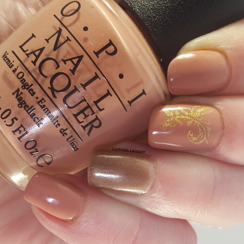
     For this look, I started off with a base of OPI Dulce De Leche from the South American Collection released in the summer of 2002. My accent nail is done with Stella from 77 Nail Lacquer which was part of their advent calendar for 2017. I really like the way these colors work together. 


         I did the stamping using Hit the Bottle A Glint of Gold with a stamping plate from My Online Shop GPS - stamping #5. 

     I have to admit that when this manicure was first finished I wasn't a huge fan. I thought it was boring and a bit blah but as I wore it it started to grow on me. What do you think of today's look? Is it something you'd wear? Thanks for stopping by and Happy Polishing!

Tuesday, April 17, 2018

6:00 AM

Untried A-Z Challenge Letter H


     We are up to the eighth week of the Untried A-Z challenge and that brings up to the letter H. What is the Untried A-Z challenge? Well, it's simple really, every other week we share a polish that corresponds with the appropriate letter. You can go be the brand name or polish name, share one polish or more. Really it's just a laid-back way to work through your untried polish and have a little fun doing it. I opted to go in alphabetical order as a way to help narrow down which untried polish to use since I often have a hard time picking out which polish I want to wear. This challenge is open to anyone who wants to participate, and you can do as many or as few prompts as you'd like. Now let's get letter H week started. 


     Once again I'm switching things up and sharing more than one polish with you today, in fact, I've got 3 polishes from Milani and two nail art looks for today's post! 

Hot Orchid
     
Medium pink metallic nail polish with subtle silver shimmer

     Hot Orchid is a medium pink metallic polish with a subtle silver shimmery micro glitter. This polish was released in 2012 and I believe was part of the core line. 

Medium pink metallic nail polish with subtle silver shimmer

    The formula for Hot Orchid has a nice consistency, it applied smoothly and evenly with a nice opacity on the first coat. Shown here is 2 coats plus top coat.

Medium pink metallic nail polish with subtle silver shimmer

      Hot Orchid is a highly pigmented polish but like most metallic polishes suffers from brushstrokes. Thankfully they are minimal and don't distract from the pretty color. You can also avoid the brushstrokes by using the tip I shared in my recent review of the Pastel City Collection from Orly

Hi-Tech

Spring green scattered holographic nail polish

     Hi-Tech is a spring green scattered holographic nail polish released in 2012 as part of the 3D Holographic collection. 

Spring green scattered holographic nail polish

     The formula on this is a little thin but applies evenly on the nail. The first coat was a bit on the sheer side but Hi-Tech builds up nicely and full opacity was reached after two coats. Shown here is two coats plus top coat. 

Spring green scattered holographic nail polish

     While this polish doesn't have a strong holographic flash it still packs a pretty punch. While I tend to wear more traditional nail polish colors I actually like this one and can see myself wearing it during the warmer months. 

Hi-Res

lilac purple scattered holographic nail polish

     Hi-Res is a lilac purple scattered holographic nail polish. It was also released in 2012 as part of the 3D Holographic collection. 

lilac purple scattered holographic nail polish

     Just like Hi-Tech, Hi-Res has a thin formula but even coverage. Once again I had a sheer first coat but nice buildability. Full opacity was reached after two coats. Shown here is two coats plus top coat. 

lilac purple scattered holographic nail polish

     This is a bit light for my personal tastes but I still think its a pretty color. I feel like the holographic flash is just a bit stronger in Hi-Res than it is in Hi-tech but still wouldn't consider it a strong flash. 

     After swatching these polishes I noticed how nicely they seemed to flow together and wanted to try them out in a gradient. 


      Because of the thinner formula of the holographic polishes the gradient ended up being very subtle. I used Hi-Tech as my base color which caused Hi-Res to look more silver than purple. 


     Of course, I couldn't stop there, so I added some stamping using the marble paradise 01 plate from Pueen and Straight Up Black from Bundle Monster.


     Straight Up Black is an intense stamping polish! It's a bit thicker than my other stamping polishes and I found that I needed to cover more of the image before scraping to get the image fully covered. The messy pointer finger is because I was impatient when taking photos and smudged it rather than a result if the image plate or polish used. 


     What did you think of my letter H polishes, do you have a favorite? Remember this challenge is open to anyone and everyone so please feel free to join in! Did you review a polish from Heather's Hues this week, feel free to add it to the link up! I'd love to get the word about this challenge out more so others can join. Thanks for stopping by and Happy Polishing! 


Like what you see? Share it with your friends!