Showing posts with label Pueen. Show all posts

Tuesday, April 17, 2018

6:00 AM

Untried A-Z Challenge Letter H


     We are up to the eighth week of the Untried A-Z challenge and that brings up to the letter H. What is the Untried A-Z challenge? Well, it's simple really, every other week we share a polish that corresponds with the appropriate letter. You can go be the brand name or polish name, share one polish or more. Really it's just a laid-back way to work through your untried polish and have a little fun doing it. I opted to go in alphabetical order as a way to help narrow down which untried polish to use since I often have a hard time picking out which polish I want to wear. This challenge is open to anyone who wants to participate, and you can do as many or as few prompts as you'd like. Now let's get letter H week started. 


     Once again I'm switching things up and sharing more than one polish with you today, in fact, I've got 3 polishes from Milani and two nail art looks for today's post! 

Hot Orchid
     
Medium pink metallic nail polish with subtle silver shimmer

     Hot Orchid is a medium pink metallic polish with a subtle silver shimmery micro glitter. This polish was released in 2012 and I believe was part of the core line. 

Medium pink metallic nail polish with subtle silver shimmer

    The formula for Hot Orchid has a nice consistency, it applied smoothly and evenly with a nice opacity on the first coat. Shown here is 2 coats plus top coat.

Medium pink metallic nail polish with subtle silver shimmer

      Hot Orchid is a highly pigmented polish but like most metallic polishes suffers from brushstrokes. Thankfully they are minimal and don't distract from the pretty color. You can also avoid the brushstrokes by using the tip I shared in my recent review of the Pastel City Collection from Orly

Hi-Tech

Spring green scattered holographic nail polish

     Hi-Tech is a spring green scattered holographic nail polish released in 2012 as part of the 3D Holographic collection. 

Spring green scattered holographic nail polish

     The formula on this is a little thin but applies evenly on the nail. The first coat was a bit on the sheer side but Hi-Tech builds up nicely and full opacity was reached after two coats. Shown here is two coats plus top coat. 

Spring green scattered holographic nail polish

     While this polish doesn't have a strong holographic flash it still packs a pretty punch. While I tend to wear more traditional nail polish colors I actually like this one and can see myself wearing it during the warmer months. 

Hi-Res

lilac purple scattered holographic nail polish

     Hi-Res is a lilac purple scattered holographic nail polish. It was also released in 2012 as part of the 3D Holographic collection. 

lilac purple scattered holographic nail polish

     Just like Hi-Tech, Hi-Res has a thin formula but even coverage. Once again I had a sheer first coat but nice buildability. Full opacity was reached after two coats. Shown here is two coats plus top coat. 

lilac purple scattered holographic nail polish

     This is a bit light for my personal tastes but I still think its a pretty color. I feel like the holographic flash is just a bit stronger in Hi-Res than it is in Hi-tech but still wouldn't consider it a strong flash. 

     After swatching these polishes I noticed how nicely they seemed to flow together and wanted to try them out in a gradient. 


      Because of the thinner formula of the holographic polishes the gradient ended up being very subtle. I used Hi-Tech as my base color which caused Hi-Res to look more silver than purple. 


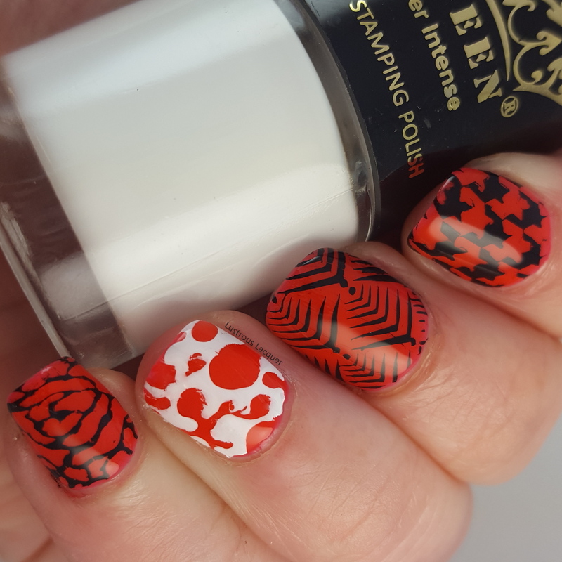
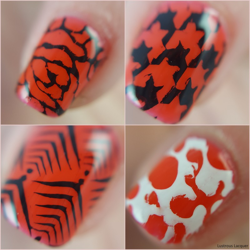
     Of course, I couldn't stop there, so I added some stamping using the marble paradise 01 plate from Pueen and Straight Up Black from Bundle Monster.


     Straight Up Black is an intense stamping polish! It's a bit thicker than my other stamping polishes and I found that I needed to cover more of the image before scraping to get the image fully covered. The messy pointer finger is because I was impatient when taking photos and smudged it rather than a result if the image plate or polish used. 


     What did you think of my letter H polishes, do you have a favorite? Remember this challenge is open to anyone and everyone so please feel free to join in! Did you review a polish from Heather's Hues this week, feel free to add it to the link up! I'd love to get the word about this challenge out more so others can join. Thanks for stopping by and Happy Polishing! 


Tuesday, March 27, 2018

6:00 AM

Orly - Pastel City Collection


     I'm back with another collection from Orly. Today I'll be sharing my thoughts on the new spring collection, Pastel City.  This 6 piece collection consists of a mixture of creme and pearl finishes in pale colors perfect for the season. Now I know the pearl finish in an unpopular one but why is that? Is it because they tend to dry with all those unsightly brushstrokes we all tend to hate? Well, keep reading because I've got a trick to get rid of those. One that just might make you want to break out that beautiful polish you've been ignoring because of those aforementioned brushstrokes.

      Electric Jungle

Icy sage green nail polish with a pearl finish from the Pastel City Collection

     Color: An Icy sage green polish with a pearl finish.

     Application: The formula for this polish is a little thinner than normal which surprised me because it's extremely opaque. I was able to get complete coverage with one coat. It is still easy to work with as the polish applied evenly on the nail. As you can see it suffers heavily from brushstrokes. But here comes that trick I mentioned earlier. You'll notice there are no brushstrokes on my ring finger, that's because I sponged on the second coat. by applying the polish this way I was still able to see the color and depth of this polish without the brushstrokes. Pretty neat huh.  Polish is shown as two coats plus top coat.

Icy sage green nail polish with a pearl finish from the Pastel City Collection

Icy sage green nail polish with a pearl finish from the Pastel City Collection

Lilac City

Icy Pink nail polish with a purple undertone and a pearl finish from the Pastel City Collection

     Color: Icy pink polish with a hint of a purple undertone in a pearl finish.

     Application: The formula again was on the thin side for such an opaque polish. This is another one coat polish with even application. As you can see Lilac City also dries with quite a few brushstrokes and that the sponging method helps eliminate them. Shown here as two coats plus top coat. 

Icy Pink nail polish with a purple undertone and a pearl finish from the Pastel City Collection

Icy Pink nail polish with a purple undertone and a pearl finish from the Pastel City Collection

Power Pastel

Pale pink nail polish with a creme finish from the Pastel City Collection

     Color: Extremely pale pink nail polish with a creme finish. This one is so pale it almost looks white. 

     Application: The formula for this one is a bit thicker than the previous two polishes but has what I'd consider a nice consistency. I wasn't quite able to reach full coverage with one coat but power Pastel is still a highly opaque polish. I did have a few streaks on the first coat and sadly this polish is not a self-leveler. Full opacity and even coverage was achieved after two coats. Shown as two coats plus top coat. 

Pale pink nail polish with a creme finish from the Pastel City Collection

Pale pink nail polish with a creme finish from the Pastel City Collection

Pink Noise

Pale peach nail polish with a pink undertone and a creme finish from the Pastel City Collection

     Color: Pale peach creme nail polish with a pink undertone.

     Application: the formula for this is a bit on the thin side but extremely opaque. Like Power Pastel, this is close to being a one coat coverage polish.  The first coat applied smoothly and evenly. Shown here is two coats plus top coat. 

Pale peach nail polish with a pink undertone and a creme finish from the Pastel City Collection

Pale peach nail polish with a pink undertone and a creme finish from the Pastel City Collection

Cyber Peach

muslin colored creme nail polish from the Pastel City Collection

     Color: Muslin cloth colored creme nail polish with a peach undertone.

     Application:  Creamy formula with a high opacity. I did have a slight issue with streaking when I applied this in a thin coat and the polish does not self-level. I was able to avoid the streaks when I switch to my "normal" coat for the application. Shown here in two coats plus top coat.

muslin colored creme nail polish from the Pastel City Collection

muslin colored creme nail polish from the Pastel City Collection


Metallic Haze

Sandy Champagne colored nail polish with a pearl finish from the Pastel City Collection

    Color: Sandy Champagne colored nail polish with a pearl finish.

     Application: The formula has a nice smooth consistency but again is a bit thin. This is another highly opaque polish with full coverage on the first coat. Like the other pearl finished polishes in this collection it also suffers heavily from brushstrokes. You can see from my ring finger that the sponging method works once again for avoiding those brushstrokes. Shown here is two coats plus top coat.

Sandy Champagne colored nail polish with a pearl finish from the Pastel City Collection

Sandy Champagne colored nail polish with a pearl finish from the Pastel City Collection


     Overall I think this collection is just ok as far as the variety of colors go. The cremes all seem to be pretty bland with the exception of Pink Noise. Although I think that one should have been named Cyber Peach. I do have to say that I was extremely impressed with the opacity of these and was curious about how they would work for stamping. Being the stamping fan that I am, I couldn't let that curiosity go unfulfilled so I did this...


     Using Power Pastel as my base I stamped an image from Pueen plate Marble Paradise 01 with Electric Jungle, Lilac City, Pink Noise and Metallic Haze. As you can see I was right to think that these would stamp. They all worked beautifully! 

     What are your thoughts on this collection, are you like me and wish that there was a bit more color to the creme finishes? Did you find my little trick for avoiding brushstrokes helpful? Let me know what you think in the comments and as always, Thanks for stopping by and Happy Polishing!


Thursday, November 23, 2017

6:00 AM

Sally Hansen - Lightning


     Happy Thanksgiving to those of you celebrating today. I've got a quick post to share with you before getting started on cooking our holiday feast. This will be my family's first Holiday season in our new house and my very first time ever hosting a Holiday. Wish me luck! 

     The polish I'm sharing today is one I've had in my collection for about 6 years and is part of Sally Hansen's core line of colors in the Insta-Dri line. Lightning is a bright sunny yellow with a creme finish. It's just the sort of color I need to keep myself cheerful while I try my hand at creating my Thanksgiving meal. I'm not exactly known in my family for my cooking skills so the pressure is really on.


     The formula for me was much thinner than I expected but like I mentioned I've had my bottle for a long time. I may have not gotten it completely remixed before application. Because of this, the first coat was very streaky. Like all the polishes in this line, Lightning is extremely pigmented and I was able to reach full opacity and even coverage after 3 coats. I typically use the Insta-Dri line for stamping because of their extreme opacity and thicker formula. Which is why I think my issues with the thinner formula were more user error than the polish itself. 


     I think the age of my bottle and the fact that my nails STILL have ridges in them for my foray into gel nails back in March are the reasons I needed 3 coats for even coverage. If the ridges were not there I feel like I could have gotten away with my usual 2 coats. Shown in all my pictures are 3 coats of lightning plus top coat.


     Yellow is a color that is not always easy to pull off, and with my pale skin tone, yellow's typically look horrible. But that's not the case with this one. I actually like how it looks on me, which was a pleasant surprise. In fact, I liked it so much I wore it as a manicure for a few days, with some added stamping of course.


     I didn't want to take away from the brightness of Lightning too much so I went for a more subtle look.  I used Frenzy Polish Gossamer and Pueen plate Fairytale lover 01 that I picked up from Walmart. 

     Have you found a yellow polish that works well on you? Let me know in the comments! As Always Thanks for stopping by and Happy Polishing! 


Friday, August 4, 2017

6:00 AM

Pueen Stamping Kit review


     While browsing through my various Facebook groups I've come across many people asking about the Starter stamping kit from Pueen. Since I was one of the lucky ones to find this kit at my sort of local Wal-mart I decided to test it out and share my results with all of you. Since purchasing this kit I've noticed that more and more people are beginning to find it in their stores so if it's not at yours yet, be patient it will get there.  This is my first experience with Pueen products but after using this kit they won't be my last. Read on to find out why.


     The starter kit contains 1 image plate with 12 patterns, a super squishy stamper, a plastic scraper and 2 stamping polishes. (1 black, 1 white) Basically, everything you need to give stamping a try. I personally think this is a great bang for your buck with its $10.00 price tag.


     As you can see this image plate has a variety of images covering several themes. I opted to use images with varying thickness to the lines so I could really see just how well it worked. For my base color, I used Sinful Colors Eccentricity from the newly released Color Eccentric Collection.


     I found the polishes to be extremely opaque and easy to work with. I needed less polish on the image plate before scraping than I typically use and was still able to get the entire image fully covered. That's huge for me since I have this irrational fear that I'll run out of a product and not be able to get it again, plus let's be honest, I'm cheap and like my products to last as long as they can.


 Each image that I tried picked up nicely on the stamper and transferred effortlessly onto my nails. I did notice that the polish seemed to stay wet for longer than my other stamping polishes so I would wait an extra minute before applying top coat. That way you can avoid smearing your image.

     Along with the starter kit, Wal-mart also carries a single image plate from Pueen that retails for about $6.00 which I also snagged but haven't had a chance to use yet. Overall I'm very impressed with this kit, I feel that it is a great investment for any nail artist whether you're just starting out or have been stamping for years. I also feel that this is the most success I've had with stamping as far as crisp clean lines and full images. 

     Have you spotted this kit in stores yet or picked one up yourself? I'd love to hear your experiences and thoughts. Thanks for stopping by and Happy Polishing!

Like what you see? Share it with your friends!