Showing posts with label Essie. Show all posts

Tuesday, November 7, 2017

6:00 AM

Gold Nail Polish Stamping Comparison


     Even though I haven't been blogging lately doesn't mean I haven't been painting my nails and trying new things. I still don't have a lot of time to devote to blogging but I'm trying to work it back into my schedule and share some things I've been working on. For right now my plan is to get 2 posts up a week on Tuesdays and Thursdays until things settle down on my end and I can devote more of my energy to the blog. I thought a comparison post was a great way to start things off and let people know that my blog is still here.

    We all know that stamping plays a big part in nail art and people are always on the lookout for regular polishes that work for stamping. Helping people find those rare drugstore brands that stamp well was the idea behind my stamping comparison series. Sadly, I drifted away from it while trying to work on my swatching and polish reviews. Now it's time to get back to the fun stuff, comparisons and nail art!

     The polishes I'll be comparing for you today are Finger Paints She's a Beaut, Essie Good as Gold, Hit the Bottle To Have and To Gold and Maybelline Bold Gold.  I decided this time around to show each color over black and white using an image from Uber Chic Plate UC 10-02
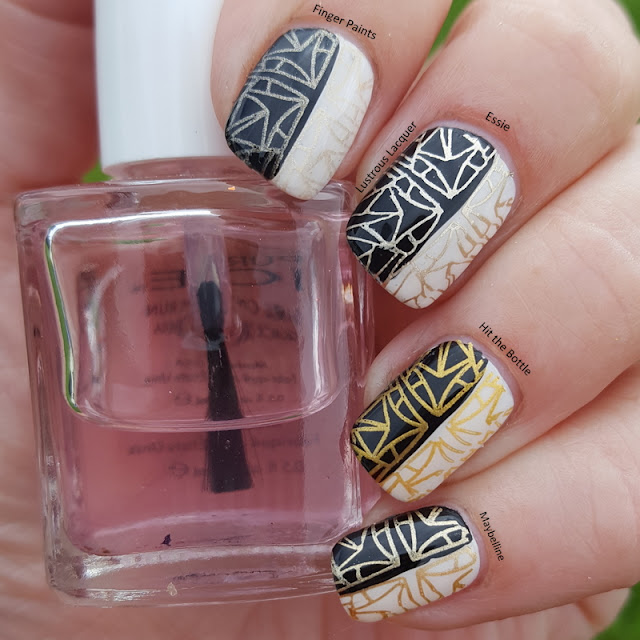

    As you can see each of the polishes I picked worked well for stamping. Yay! But there are subtle differences to each one. For example To Have and to Gold from Hit the Bottle is more of a yellow gold and She's a Beaut from Finger Paints is the lightest.


     I have to say out of the 4 polishes used I like Essie's Good as Gold the best because of the color and vibrancy.  It looks the most like gold in my personal opinion and works the best over both black and white. Although the Maybelline Bold Gold is a close second. 


     Which one is your favorite? Do you have a gold polish in your collection that works great for stamping? Let me know in the comments. And don't forget to check out my previous stamping comparison posts of Black, White, and Silver. Thanks for stopping by and Happy Polishing!

Friday, August 5, 2016

6:00 AM

Metallic Gradient with a Stamped accent


     Have you even be perusing Pinterest and stumbled across a pin that made you want to whip out your nail art supplies right then are there? Well, that's exactly what happened to me when I can across this pin. I loved the vintage look and feel of this manicure and the muted color scheme. Sadly it was the late hours of the night and my nail art would have to wait.  But as I lay there in bed supposed to be sleeping my brain just kept coming back to the manicure I was thinking of completely inspired by that pin. 

     I lay there for over an hour working out my color scheme, which plate I might want to use, and I knew that sleep would be impossible. Until I wrote my idea down that is. Which is exactly what I did. I ran to my desk, grabbed a pen and paper and jotted down the rough ideas I had, went back to bed and instantly fell asleep knowing my idea was safe from being lost to the hidden corners of my mom brain.  So what was this important manicure idea that caused my a restless night? Let's take a look

metallic-gradient-essie

    While I knew I didn't want to recreate that inspiration manicure completely I still wanted that muted earthy feel of the color scheme. I tossed around the idea of using 3 colors in the gradient, with blue adding a little pop of color but quickly discarded that thought. And I think I made the right decision. I like the way that Penny Talk and Good as Gold from the Essie Mirror Metallic's collection makes a subtle gradient allowing the blue in my accent nail to really pop.

essie-mirror-metallics-collection

      I should also mention that these metallic polish work best in a gradient if they are layered over a white base. I used Finger Paints Paper Mache as my base color. One thin layer was all I needed under the gradient but I used 2 on my accent nail for a completely solid base. And speaking of accent nails... here's a close up of mine!

Metallic-nail-art-gradient-essie

    I just love how this whole manicure turned out, but I'm mostly proud of the accent nail. I tried my hand at making my own decal again and it was so much easier using my Simply Neat Miracle Mat  (affiliate link) instead of just my stamper. Seriously this mat has made a huge improvement to my nail art process.  I feel like I have space to create looks and not worry about making a mess.  I'm getting a bit off track so I'll get back to how I created this look but seriously if you're looking at getting a mat for nail art I would highly recommend this one. 

   Ok so now that that shameless plug has been put in, back to the manicure. For my accent nail, I used MoYou London plate 03 from the Paradise Collection and Finger Paint Black Expressionism to create the outline. I then filled in the image with Penny Talk and Good As Gold trying to mimic the gradient effect in the petals. To get a small pop of color Blue Rhapsody also from the Mirror Metallics collection added the perfect touch. I topped it all off with Sally Hansen Double Duty which is the only top coat I've found that dries in a reasonable amount of time but is still pliable so that I can apply the decal to my nail without cracking. If you've been having the same issue with your decals give Double Duty a shot and I promise your frustrations will be over. Tuck that little tidbit away as my own little tip from me to you. You can thank me in the comments ;)

    I loved this manicure, I love the colors, the way the accent nail turned out but mostly I loved how proud of myself I was while wearing it. Because it was finally a manicure that turned out exactly how I pictured it in my head. And we all know that doesn't happen often for me. Now the only question I have for you is.... was my accent nail technique considered reverse stamping or just making a decal? I'm a little fuzzy on what the difference is and would love some clarification. Thanks for stopping by and Happy Polishing! 


Wednesday, November 4, 2015

6:00 AM

China Glaze - Your Touch


     Happy Hump day Everyone! I hope your week is off to a good start. As of Monday I am down to just 1 full time job instead of 2 part time ones and hopefully that will free up some time for my blogging. I've missed posting on a consistent basis and hearing your thoughts. 

     Speaking of thoughts, Id love to hear yours on today's polish. Originally released as part of the Holiday Fine Wine and Chocolate collection (2007) and is now part of the core line, I think  China Glaze Your Touch is a great color for fall.  A dusty rose brown with golden shimmer. I don't know about you but I tend to go in spurts with my color choices. I go through phases where I'm drawn to pinks or coppers or reds. It doesn't always follow the seasons but right now it seems to. I've been drawn to the deep rich colors I see in the leaves around me. 

Your-Touch-China-Glaze-Fine-Arts-and-Chocolate-Collection-2007

     Shown here is 2 coats plus top coat in natural light. Application is smooth and even with a few pesky brush strokes here and there. But they are not as visible as my camera wants to make them out to be.  And for a shimmer it's pretty opaque. I'm very tempted to stamp with it. I didn't do that this time but I do have a little nail art to share at the end of my post. 


    If you're in the market for a great earthy tone that isn't a neutral Id say Your Touch is a great polish to pick up. In certain lighting you get this really cool coppery effect that is just stunning. 


    Now about that nail art I mentioned earlier... the original idea came from a video I saw online by @nailyourideas but mine didn't turn out quite the same. I still love the look but need to apologize for the sub-par cell phone shot. 


    I used Essie Good as Gold to create my accent nail and play up the golden shimmer in Your Touch. This was a very easy look to create but I need to "swoosh" the polish around a bit more next time to really nail it. That's all I've got for you today, be sure to check back Friday where I'll have another look for the 40 Great Nail Art Ideas Challenge. Thanks for stopping by and Happy Polishing! 

Wednesday, July 15, 2015

6:00 AM

Put Up Your Dupes - Sally Hansen Silver Sweep vs Essie No Place Like Chrome


      About a month ago I did a post comparing how 4 silver nail polishes worked for stamping. While doing that post I discovered 2 sets of dupes. The first set I've already posted about: Zoya Trixie and Sally Hansen Celeb City. Now it's time to see if Sally Hansen Silver Sweep and Essie No Place like Chrome are true dupes too. 


     Looking at these two in the bottle they look very close but seem to have a slightly different finish. Silver Sweep seems to have more shimmer, but does that transfer over to the nail?

2 coats no top coat

     In fact, it does! While both polishes are completely smooth to the touch No Place like Chrome has a smoother look to it. However, the color itself is exactly the same. And these are so close that looking at them I thought they were 100% dupes. I only noticed the differences when editing my photos. 

     Both polishes are extremely opaque on the first coat and work great for stamping. No Place like Chrome did give me some slight dragging during application and having less shimmer shows more of those pesky brush strokes. Another downfall of the smooth finish in No Place like Chrome is that it is extremely unforgiving when it comes to imperfections on the nail. 

2 coats plus top coat

     The addition of top coat made the faint brush strokes in Silver Sweep pretty much disappear, while you can still see some in No Place like Chrome.  Just how close are these two if they aren't 100% dupes? Let's see if a macro shot can help us out...


     When we look this close the differences are impossible to miss. So sadly while these 2 are very similar they are not dupes. Do you need both? Probably not, but which one do you choose? 

     I would have to say that Silver Sweep just edges out No Place like Chrome for me. I tend to suffer from ridges in my nails and I like that Silver Sweep disguises them more than No Place like Chrome. And then, of course, we have those brush strokes, Silver Sweep wins in that category for me as well. I do like both colors though and to be honest, glad to have them both in my collection. Thanks for stopping by and Happy Polishing!


Wednesday, June 10, 2015

6:00 AM

Silver Nail Polish Stamping Comparison


     Happy Humpday everyone! How's your week going so far? My kids keep telling me that they have run out of things to do and are constantly bored. I guess we are in for a long summer. While I brainstorm ideas to keep them entertained why don't you take a look at today's blog post. I've compared 4 popular silver nail polishes to see how well they work for stamping. The polishes I tested are Sally Hansen Silver Sweep (Insta-dry line), Zoya Trixie, Essie No Place Like Chrome, and Sally Hansen Celeb City (X-treme wear line). Just how well do these silver polish staples work for stamping? Let's take a look.


     Using L'Oreal After Hours as my base I set to work, choosing an image that had some larger spaces as well as some intricate designs from Konad plate M51.  As you can see all 4 polishes worked very well, but they have 2 different finishes. No Place Like Chrome and Silver Sweep have more of a chrome look to them, while Celeb City and Trixie have a shimmery finish. For this particular image, I like the delicate sparkly look of Trixie and Celeb City. But there is something to be said about the bolder look of No Place Like Chrome and Silver Sweep.


     While working on this post I think I may have found 2 sets of dupes, but I will get more into that in another post. So make sure you come back! 

     Id say depending on the look you're going for its users choice as far as which one to reach for. Generally, the Sally Hansen polishes are a bit more budget-friendly, and easier to get your hands on. But those seem to be the only real differences when it comes to these 3 brands.  I hope you enjoyed this post and found it helpful. Thanks for stopping by and Happy Polishing!


Monday, June 8, 2015

8:09 AM

Madam Glam - Found the One


     Good Monday Morning to you! I hope everyone had a fantastic weekend. Today I am rounding up my trio of posts featuring Madam Glam polishes. I saved my favorite one for last, Found the One. 

Photo was taken in incandescent lighting

     Found the one is a dark vampy red polish with a jelly finish. The application was good, with the first coat applying a little uneven. Everything smoothed out after 2 and dried to a super glossy finish.

Photo was taken in natural light

     While not a traditional red I still think Found the One gives my nails a classic look. And I love how the red color comes out in the sunshine. 

Photo was taken in incandescent lighting

Photo was taken in natural light
     I tried out a little nail art and am pretty happy with the results. I just wish the studs I used matched the gold polish a little better. 


     For the stamping, I used Messy Mansion plate MM18 and Essie Good as Gold.  The studs I picked up from Dollar Nail Art. Which if you haven't checked that site out I highly recommend that you do. You'll find a ton of nail art supplies, very reasonably priced. The only downfall is that there is a minimum purchase of $25. 

     If you're thinking about picking this polish up for yourself follow this link  http://madamglam.com/?utm_source=yt-lust 
and used code YT30 for 30% off your entire order.  Don't forget to check out my previous posts
featuring Disco Ball, Ibiza, and Paradise Fiesta. Thanks for stopping by and Happy Polishing! 

Monday, April 20, 2015

6:00 AM

Embossed Metal Manicure


     Today I have a tutorial of sorts to share with you on how to achieve that embossed metal manicure look that has been floating around the internet lately. I say a tutorial of sorts because I didn't quite achieve the look I was going for and this is more of an experiment that I tried and decided to share. Plus I have an ulterior motive,  I'm hoping some of you talented ladies will have some tips or tricks to share so my next attempt will be a success. 

     Let me start out by showing you what I ended up with and then I'll get into the steps I took to get there. I really do love this look and my goal right now is to master it!


     I started this manicure off with a coat of Orly Bonder on a nail tip. I wanted a semi sticky base to hold the design. Which was a good idea, but ended up not working quite as well as I had planned. I'll get more into that later on in the post but if you look closely at the picture above you might get an idea of what Im talking about. 

       For the design I chose a 3D sticker from Born Pretty Store
6pcs 3D Nail Art Stickers Gold Embossed Texture Heart Star Lace Pattern Decals.


     I really liked the look of a few of these stickers but for my experiment I went with one of the designs with all the curls. (Far right of the picture) Here is where I made my mistake. I placed the sticker on the nail tip but I didn't make sure to press down firmly near the edge. You know, right where the tip starts to curve.


     Can you guess what happened? That's right the stickers popped off of the nail surface, only I didn't notice it until after I had added my first layer of polish. Can you say face palm moment! When it comes to my own nails I press the tape or decal down and hold it there for a few seconds and then repeat until I know it's good and stuck. I knew I needed a semi sticky surface for this to work, but I think the Bonder gave me false hope about the sticker sticking without the extra pressure I normally apply.

     Now for the magic! How do you transform a 3D sticker to embossed metal? Cover it up with a metallic finish nail polish of course. I chose Essie Blue Rhapsody although Penny Talk was a tempting choice.

How-to-create-an-embossed-metal-manicure
2 coats of Blue Rhapsody without top coat

    Like I mentioned above this is pretty close to the look I was going for. I have to fix the problem of the sticker sticking up at the side, which seems simple enough to do. What I need suggestions for is how to avoid seeing the edge of the sticker along with the 3D design. I think that is what's keeping me from absolutely loving the finished look. What do you think, am I being too critical? Id love to hear your thoughts on this new nail trend or any suggestions you have. 

     If you'd like to try this technique out but need the stickers make sure to use code LAUNX31 to save 10% on your entire order from Born Pretty Store. Thanks for stopping by and Happy Polishing!

Monday, June 9, 2014

6:00 AM

What's in a finish?- Flakie


     Today brings us to the last post in my What's in a finish series with Flakies. And who doesn't love a good flakie polish right? I know I'm still lusting after the first flakie collection Finger Paints released a few years ago. But what is a flakies polish? Well, the answer is actually pretty simple.

Finger Paints Colorful Dreams
Colorful Dreams


     A flakie polish has a jelly base with very fine usually opal particles. These particles are larger than your typical shimmer and have irregular shapes to them.

Essie Shine of the Times used on the accent nail

    When the light reflects off of these particles you will get flashes of color. Depending on the direction the light is coming from you will see different colors. Fakies are like Duo Chromes or Shimmers in that aspect.

     It's easy to get confused between a Glass Fleck finish and Flakie with the only real difference being the size of the particles. The particles in a flakie are much larger and easier to spot.


     And that brings us to the end of this series. I hope you enjoyed reading it as much as I did putting it together. Thanks for stopping by and Happy Polishing!


Wednesday, June 4, 2014

6:00 AM

Mentality - Tempest


     Today I have for you Tempest from Mentality. Tempest is from the Ombre Mattes Collection and is a blackened dark red with red shimmer. I was lucky enough to snag this beauty from a blog sale. The application process was smooth. I didn't experience any dragging like I have with other matte polishes. However, as you will notice the shimmer is hard to see once the polish dries. All pictures shown are 2 coats.

Mentality-Tempest-Matte
     
     I love the look of Tempest matte but wanted to see if I could get some more of the shimmer to show with top coat.

Mentality-Tempest

     You can start to get a glimpse of the depth that Mentality has with the addition of topcoat. Here's a Macro shot for a closer look.

Mentality-Tempest

     And now to share with you the reason for those 2 stripes on my ring finger. I decided to do some negative space nail art inspired by LacquerStyle. You can see her manicure here. This is my version.


Mentality-Tempest
     
     I used Essie Shine of the Times for my flakey strip and then topped everything off with a matte top coat. I really like how this turned out. It felt elegant and fun at the same time.

     I have a few more Mentality polishes on my wishlist but would love to hear some of your favorites or must haves. Thanks for stopping by and Happy Polishing!


Monday, February 24, 2014

6:00 AM

What's in a finish? - Metallic


     Hello there everyone and Happy Monday. Today I want to talk about Metallic finish nail polish. Some characteristics of metallic nail polish are that they make your nails look like metal and have a smooth almost mirror like finish. The most popular colors are copper, gold, and silver but over the last few years, we have seen companies branching out into other colors. For example, Essie's Mirror Metallic collection contained a blue. You can find my review of the entire Mirror Metallics collection here.

Essie-Blue-Rhapsody-Mirror-Metallics-Lustrous-Lacquer
Essie Blue Rhapsody
     Foil finishes are often confused for a metallic finish because they have a similar appearance. However, foils contain micro glitters to give them a metallic feel but true metallic finishes contain no glitter.

Fingerpaints-She's-a-Beaut-Lustrous-Lacquer
Finger Paints She's a Beaut
     Unfortunately, some downsides to the metallic finish are that they leave brushstrokes and tend to show every imperfection on your nails. One way to help prevent this is to use a good ridge filling base coat and either a thick layer of top coat or two thin layers.

     I hope you've enjoyed this post. If you'd like to read earlier posts in this series just click on the "what's in a finish" tag below. Happy Polishing!

Wednesday, December 4, 2013

12:00 AM

Messy Mansion Image plate review


     Hello everyone. I'm kind of excited about today's post. Why? Well, I was sent some image plates from Messy Mansion for review and I can't wait to share them with you. These plates can be purchased online at http://www.messymansion.com.au/. I received 3 plates to share with you.

     My package arrived in pretty rough shape with a letter from the postmaster stating they had an accident with my package and an apology. The edges of the plates got slightly bent, but I was able to bend them back for the most part. I wanted to let you know that because you will see it in my pictures and I don't want you to think that's how the plates are. And I also want to let you know that mine is a rare experience and your plates should arrive safe and sound.

     First up is Lilly Anna 08.  A rectangle shaped plate with 12 full sized images and 2 longer images. There is a variety of images on this plate, from geometric patterns to snowflakes.

Messy Mansion Image Plate Lilly Anna 08

     If you follow my blog or facebook page you know that stamping is not my strong suit but I'm getting better. This plate was really easy to work with. I wanted to try images with a delicate pattern and a wider one. And I was in love with the snowflake image from the moment I opened my package.


     I used China Glaze For Audry as my base and Konad White to stamp with. Every image I tried transferred to the nail with ease. And I was able to cover the entire nail. The one I'm most impressed with is my ring finger. I thought all those lines so close together would be tricky, but I had nothing to worry about.

     Next up I have plate MM18. A round plate with 4 full nail images, 6 individual images, and a long image.

Messy Mansion Image Plate MM18

     I used the bee theme as my inspiration for testing this plate.


     I used Sinful Colors Pull Over stamped with Konad Black. Again I was able to transfer the complete image to my nail on the first try. I love the little bee inside the honeycomb pattern.


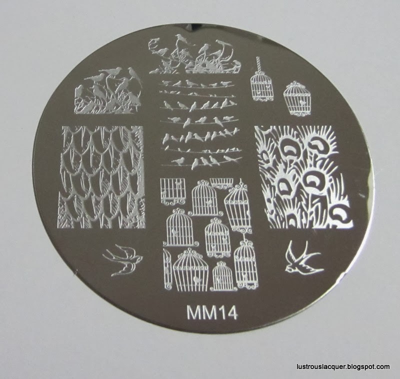
     The last plate I have to show you is MM14. Another round plate with 4 full nail images, 3 individual images and 2 half nail images.


Messy Mansion Image Plate MM14

     My nails are short enough that the half nail image ended up filling up pretty much my entire nail. For this plate, I wanted to see how it would stamp using a regular polish instead of my Knoad stamping polishes.


     I used Orly Dayglow and stamped with Essie Blue Rhapsody for these cute birds. I knew I wanted to try out the peacock feathers and the little birdcage right away when I saw this plate. And as you can see my ring finger is completely covered by the birds on the branches image.  The peacock feathers are a little big for my small nails but I still really like that image. I'll have to play around with the placement a little bit to make it work for me.

     I found all 3 of these plates easy to use and the images all transferred very well. In fact, I've already added a few more plates to my Christmas list.

     To keep up with all the latest news from Messy Mansion be sure to check out the facebook page, and the shop.

     Which plate was your favorite? Are there any others I should check out? Thanks for stopping by and Happy Polishing!


*The products shown were sent for my honest review. All opinions and photographs are my own*


Tuesday, December 3, 2013

12:00 AM

The 12 Mani's of X-mas Day 2: Snow/Winter


      Hello, again my fellow polish lovers!  It's day 2 of the 12 Mani's of X-mas Challenge and today's theme is... snow/winter.


     I had a hard time coming up with an idea for this since I didn't want to do the typical stamped snowflake manicure. While looking at the prompt picture for today inspiration struck. Who doesn't love the look of freshly fallen snow on the tree branches? It really is a magical sight, especially when it's the first one of the season.


     For this manicure, I started with a gradient of China Glaze Sci-Fly-By and Milani White on the Spot. For the trees, I used my black striper and Rimmel Rags to Riches for the pine tree. Then I went in with my white striper to add the fallen snow. Finally, a sponged on some Essie Shine of the Times to the tips for a glistening snow effect.

     This manicure actually turned out pretty close to what I had pictured in my head and I'm pretty proud of that. I don't do a lot of freehand nail art so this was a bit of a challenge for me. How do you think it turned out?

     Make sure to check out the other entries for day 2 of the challenge and stop back in a few days to see what I came up with for day 3. Happy Polishing!


Thursday, October 24, 2013

7:28 AM

A bit of Nistolgia.....


     Today's post is inspired by Jen from Xoxojenn . She did a post about her first posted nail picture and I thought it would be fun to do one too. After all, isn't seeing how far you've come part of the fun of blogging? You can see Jen's post by clicking the link above or following the inlinkz code at the bottom of this post.

      If you read my post about what got me started with nail polish you know that it was a stamped manicure my friend posted that first piqued my interest.  So, of course, I ordered a few image plates and the first picture I ever posted online was, in fact, a stamped manicure. I took the picture with my cell phone and posted it on my personal page. I got a little feedback but mostly people asked me why I was posting my nails. Especially after I posted more than a few pictures.


     So here it is in all its unedited glory. At the time I was pretty proud of it. Back then I had no idea how important clean up was. Or how unforgiving the camera is to dry cracked cuticles. And forget about nail care. All I knew was that my nails were nice and long,  and I was hooked on nail art. I decided to start my FB page with no intentions at that time to add a blog but, as my love of all things polish grew so did my desire to share it.

     Which brings us to today. It saddens me to say that my stamping hasn't improved a whole lot over the last year. But my photography skills and nail care have come a long way. I still have tons to learn but it's a fun process and I look forward to the challenges. This is the last picture I shared of a stamped manicure. It was a manicure I wore about 5 months ago.


     Looking at these photos has helped me remember why I started this crazy journey in the first place. It's also made me want to get out my stamping plates and play around a bit.


     I hope you enjoyed this little walk down memory lane with me. Don't forget to check out the posts other bloggers have written and Happy Polishing!


Tuesday, October 15, 2013

12:31 PM

Essie Mirror Metallics Collection


    Today I have a review of the Essie Mirror Metallics collection. This  5 polish collection was released in June of 2012. I was so excited when I first saw swatches of these polishes. So much so that I decided to use it as motivation to quit smoking. After one month of not smoking, I took that money I would have spent on cigarettes and bought the entire collection. It was the first and only collection I bought all at once. So as you may have guessed I had some pretty high expectations for these polishes.

     So why did I wait so long to finally use these? Well, I've read a lot of reviews on these polishes over the last year. And the results are all over the board. Some people rave about the amazing application, others say they are hard to work with. I was beginning to have a slight case of buyers remorse. I decided I needed to find out for myself. And I have to say my opinion lands somewhere in the middle. The formula for all 5 polishes are pretty much the same so I'll go into more details about that after the photos.

   * All photos are 2 coats of polish without top coat taken with incandescent lighting.*

Essie Nothing Else Metals, Mirror Metallic Collection

     Nothing Else Metals is described as an “ultramodern lilac alloy”.  I like the modern take on such a girly color.

Essie Blue Rhapsody, Mirror Metallic Collection

     Blue Rhapsody is described as a “heavy metal air force blue”, but I loved how this shade seemed to morph from cool to warm-hued, depending on the light. At moments it had an almost gunmetal look to it.

Essie Penny Talk, Mirror Metallic Collection

     Penny Talk is described as a “statement-making incandescent copper”, If you're looking for that new penny look this is the polish for you.

Essie No Place Like Chrome, Mirror Metalli Collection

     No Place Like Chrome is described as a “richly oxidized nickel”, bears an uncanny resemblance to polished steel.

Essie Good as Gold, Mirror Metallic Collection

     Good as Gold is described as a “pure, rock-solid classic”. This shade is a little more honey-ish then deep yellow and is my least favorite color in the collection. 

     So, about the application.... There are pros and cons to these polishes. All 5 polishes are extremely pigmented and could almost be one coaters. Which will probably make them good for stamping. However like with all metallic/foil finish polishes they are extremely unforgiving to less than perfect nails. I would highly recommend a good ridge filling base coat when wearing these. For me the polish flowed nicely off the brush and onto the nail for even coverage. I was pleasantly surprised at the lack of brush strokes visible once dry. These polishes do dry extremely quickly, but I would wait until the first cost is completely dry before adding a second to avoid dragging.

     Some bloggers have had issues with these polishes not leveling out nicely and leaving ridges on the nail.  For the most part I was able to avoid that by applying 2 thin coats. I did have a slight issue with ridges when using a thicker coat on one of my nails, but I was able to fix it pretty easily.

     Over all I am happy with my purchase, No more buyers remorse for this little polish lover.   Copper Penny and Blue Rhapsody would have to be my favorites of this collection because they are different from anything else I own.  What are your experiences with this collection? Do you love them or hate them?

     Thanks for stopping by and Happy Polishing!


Sunday, September 22, 2013

6:13 PM

Essie Wrapped in Rubies


     Today's NOTD post is Essie Wrapped in Rubies from the winter 2007 collection. A deep rich brownish red with subtle golden shimmer. My daughter was actually the one to pick this color out at the store and I was hesitant at firsts to buy it. In the bottle, it looks more brown than red and I wasn't sure I would wear a deep golden brown on my nails. But she begged and gave me her sad puppy dog eyes that I have a hard time refusing so I gave in and bought it.  I owe her a big thanks because this color is jaw-droppingly gorgeous.

     Wrapped in Rubies seems more like a fall color to me with its brown undertones. Although in certain lighting it reminds me of a garnet which is more winter I guess. That being said this color will help transition the season effortlessly.

     I used 2 coats of Wrapped in Rubies plus top coat for this picture. The application was nice and smooth. The polish flowed nicely off the brush without flooding my cuticles. The first coat covered pretty well with only a few streaks here and there. Full opacity was achieved with the second coat and it dried to a semi-gloss finish

Essie Wrapped in Rubies
The photo was taken indoors in incandescent light

     As you can see that golden shimmer in the bottle doesn't transfer well to the nail. As I sit here looking at my nails I can get hints of the shimmer as I move my nails back and forth. Once outside the shimmer shows itself a little more but not quite like I was expecting.

Essie Wrapped in Rubies, winter 2007
The photo was taken in full sun
     Now don't adjust your monitors. That picture is unedited (except for the watermark) Full sun gives Wrapped in Rubies a luminescent glow on the nails unlike any I have ever seen. Still no real evidence of that golden shimmer but we can all agree it plays a big part in how this polish looks outdoors.

Essie Wrapped in Rubies, Winter 2007

     And one more shot just because I love how this one turned out with the green grass as a background. I only have a few more weeks of green grass here in Minnesota before the snow starts to fall so I have to take advantage while I can.


     So what do you think of Wrapped in Rubies? Do you think it is a fall or winter color? Once again thanks for stopping by and happy polishing!

Like what you see? Share it with your friends!