Showing posts with label Sinful Colors. Show all posts

Monday, May 6, 2019

6:00 AM

Japanese Cherry Blossom Nail Art in 4 Easy Steps


     Have you ever sat down to paint your nails and had the end result be completely different than your original idea? That's just what happened to me when I created this Japanese Cherry Blossom look. I've actually wanted to do a manicure like this for quite some time but just never seemed to get around to it. I've either had other ideas come first or just haven't been inspired to sit down and actually create it. 

     Now I could get all philosophical and say that fate stepped in and in its way pushed me to finally create this nail art but I think it was more of a case of being inspired by the colors that I used.

     Back in February I rushed out to Walmart to find the latest core colors from Sinful Colors and have had them sitting on my desk ever since. We all know by now that I have a habit of doing this and I'm really trying to get better about it but old habits are hard to break I guess. Anyway, I've been looking at Violet Riot and Strike a Pose for months thinking that they would look great in a gradient. Which I finally put to the test last week and I was right. They go together beautifully. So beautifully in fact that they created a canvas that just begged to have nail art applied. And that is how my 4-step Cherry Blossom nail art was created. 


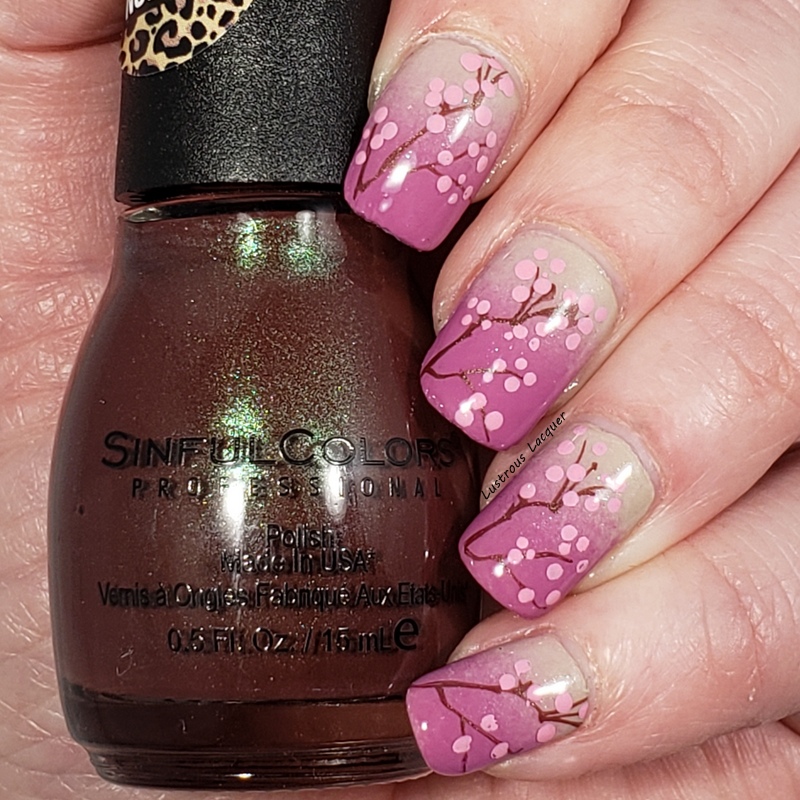
     Step 1: Paint a layer of Sinful colors Strike a Pose and let dry. This doesn't have to be a thick layer or even have full opacity since we will be doing a gradient over it. You just want to get a layer down so that you'll have better coverage on the gradient. 

     Step 2: Crate the gradient using Strike A Pose and Violet Riot. I like to use a sponge to create my gradients because I tend to get a better blend of the colors but you can do yours however you're comfortable. (The one I use is from Born Pretty Store and if you use code LAUNX31 you can receive 10% off your order.) Remember to use a liquid latex barrier around your cuticles to cut down on clean up. If you don't have liquid latex or are allergic you can always use scotch tape. Add a layer of topcoat and allow to dry fully. 


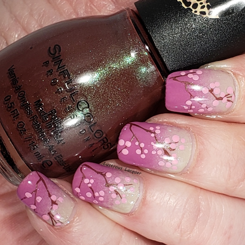
     Step 3: Stamp your desired image onto the nail. I used Clear Jelly Stamper plate Cjs-05 and Sinful Colors Body Language from the Naughty Nudes collection to create my branches. 

     Step 4: Using a small dotting tool you can create the blossoms. I used the smallest of my dotting tools and Hit the Bottle Drunk Tank Pink to create mine. I randomly placed dots along the branches and in bunches on my nails. Another layer of glossy topcoat and you're all done. 


     I've also included a step by step video tutorial for those of you who like to see how manicures are done. 


     And there you have it. My 4 easy steps to create a Japanese Cherry Blossom manicure. Pretty simple right? I actually loved how this turned out and didn't want to take it off. But like all nail bloggers know, the switching must go on and I was only able to wear this for about 8 hrs. 

    Have you ever had a manicure just sort of come together as you were doing it? Does your base color ever inspire your nail art? Let me know in the comments. Thanks for Stopping by and Happy Polishing! 


Tuesday, April 30, 2019

6:00 AM

Sinful Colors - Acapella Ella- Swatch and Review


     Do you ever buy nail polish, love it in the store and then forget about it once you get home? That happens to me all the time. When I actually buy in a brick and mortar store these days I tend to buy a few polishes at a time, especially when it comes to Sinful Colors. That is exactly what happened with Acapella Ella. I rushed out at the beginning of 2018 to purchase all the new core colors that were released and then let them sit on my desk for months. I actually swatched Acapella Ella last June but am just getting around to sharing it on my blog now. So I hope you enjoy this little blast from the past with me for today's post. 

pale blue creme finish nail polish

     Acapella Ella is a pale blue creme nail polish. In fact, you could almost say it's a blueish tinted white with how pale it is. A great color to use as a base for nail art in my opinion.

Pale blue nail polish with a creme finish.

     The formula is what I have pretty much come to expect from Sinful Colors. The first coat applied nicely, but not perfectly. The opacity is nice but I did have a few streaks. Thankfully they self-level and are gone when the polish dries. 

     The second coat applied much nicer with no streaking and even coverage allowing for full opacity. My photos are shown as two coats plus glossy topcoat. 

Pale blue almost white nail polish with a creme finish

     For me, this polish is a nice pallet cleanser from all the holos and flakies that I tend to reach for. I've already mentioned I think it would make a great base for nail art. (Which I need to get back to doing.) I also think that even though I'd consider this a pastel color and wear them primarily in the spring, this color transitions well into the summer months also. 

     What are your thoughts on pale colors like this? Do you think it needs a little shimmer to spice it up or is just fine as it is? Let me know in the comments and as always Thanks for stopping by and Happy Polishing!

Tuesday, August 28, 2018

6:00 AM

Sinful Colors - Radical Mattes Collection


   I recently stumbled upon a new collection from Sinful Colors at my local Walgreens and of course, had to snatch it right up. I then went home to look up the new collection on their website. What did I find? Absolutely nothing, there is no mention of this new Radical Mattes Collection on their website or social media channels. Huh, I wonder if my store put them out too early? Lucky me I guess! 

    Anyway, I'm going to go ahead and assume that this is their Back to School collection for 2018 and will update the post if I find out otherwise. This collection consists of 7 matte finish cremes and a matte top coat. Now I have to say that in my opinion, this isn't a matte collection, especially compared to the Wild at Heart collection from the summer.  The Wild at Heart Collection dried to what I consider a true matte finish while this new collection dries to a rubbery semi-matte finish. In fact, the finish on these reminds me of the Full Throttle collection from 2014.  Even the matte top coat dries a bit more rubbery than a traditional matte finish but is closer than the polishes in this collection. 

     All polishes are shown as 2 coats plus the Sinful Colors matte top coat and photographed in my lightbox using daylight light bulbs. 

Brave

Rusty orange colored nail polish with a matte finish

     Color: A rusty orange creme nail polish with a semi-matte finish

     Application: The formula on this is a bit thicker than I'm used to but still easy to work with. Because of the thicker formula, the polish is very opaque but wanted to apply a bit streaky but not enough to leave bare spots on the nail. So it was almost more like ridges then steaks. Thankfully this polish self-levels so you are left with a smooth finish. 


     I think this is an interesting color, it's not one that I would typically reach for and I'm not 100% sure I will actually wear it again. The opacity makes me wonder if it would work well for stamping, and the thickness makes me question if it would watermarble. 

Defiant

Dusty lavender colored nail polish with a matte finish

    Color: A dusty lavender creme nail polish with a semi-matte finish.

     Application: The formula for Defiant is an exact copy to that of Brave. The polish is thicker but easy to work with, again I had issues with the ridge/streaks, and the polish self-levels. The is a beautiful opacity to this that makes me want to try and stamp with it. 


     I find that I actually like this color. I would easily wear it again and use it as a base for nail art. Like I mentioned that high opacity makes me want to try stamping with it, I can see it working for those images with intricate designs to them. Sadly my macro shot made this polish lean more to the blue side, but I assure you it looks just like my full hand images. 

Fearless

Dark berry pink colored nail polish with a matte finish

     Color: A dark berry pink creme nail polish with a semi-matte finish.

     Application: Fearless has the highest opacity of this collection and could be considered a one coater. I found that I didn't have the issue of steaks/ridges during application with this one which was a pleasant surprise. I didn't wear this one for long but did find that it wanted to stain my skin during removal so I would highly recommend a good base coat when wearing this. Thankfully I was able to avoid any stains on my nails. 


     I am a sucker for pink nail polish and this one is a must have for me for fall. It also makes me a bit nostalgic for my high school years because I used to have scented candles all over my room that were almost this exact color. Anyone else? 

Rebel Yell

Bright red colored nail polish with a matte finish

     Color: Bright red creme nail polish with a semi-matte finish. This one actually looked a little less like a traditional red when I was wearing it, almost like it had a berry tone to it. (think strawberries) My camera makes it lean a bit more true red than what my eyes saw. 

     Application: Another highly pigments polish with nice opacity. If I had to guess I'd say this one will be a stainer also so make sure to use a good base coat. The formula on this one is again thicker and wanted to apply with those same pesky streaks/ridges. Again this polish self-levels so a smooth, even finish is not a problem


     Red nail polish is a classic for me, and I do like this color. I found myself wanting to add nail art to it rather than wear it alone though. I think if I'd added a glossy top coat I would easily wear this one alone.

Renegade

Leather brown colored nail polish with a matte finish

     Color: Brown leather creme nail polish with a semi-matte finish.

     Application: This polish has the thinnest formula of the collection. I did have issues with traditional streaks and this polish does not self-level. A second coat evens everything out and gives full opacity.


     Honestly, this is not a color for me. It's too dark for my taste when it comes to plain polish. I am going to keep it though because I have a feeling ti will come in handy for nail art or could look nice with a topper.        

Roar

Sky blue colored nail polish with a matte finish

     Color: A sky bly creme nail polish with a semi-matte finish.

     Application: Another highly pigmented polish with a great opacity. This one applied without streaks and gave even coverage. Like all blue polishes, I'm leery of staining so make sure to use a good base coat. 


     I think this color belongs with the other colors in this collection and it is a nice blue, but not one that's really for me. At least not on its own. Maybe as an accent nail, under a topper or used in nail art, but not alone. I do like how opaque it is which will come in handy if I try to stamp with it.

Rise Up

Pale blue colored nail polish with a matte finish

     Color: A pale blue creme polish with a semi-matte finish. I'd call this "It's a Boy Blue"

     Application: The formula on this one was a bit like Renegade but not quite as thin. I did have an issue with streaking and the polish not wanting to self-level but it wasn't too bad. Just a few streaks here and there. Application of a second coat evens everything out for a smooth finish.


    I feel like this color is the odd one out for the collection. All the others have a nice rich tone to them and then this one is a pastel. I do like this blue a bit better than Roar but again I'm not sure if I would wear it alone. 

    Overall I like the potential for versatility this collection has with the highly pigmented colors and am anxious to see how they will work for stamping. The colors do have an Autumnal feeling to them for me with the exception of Rise Up. Are they colors I will wear again? That's about 50/50. 

     If you're looking for this collection I have heard it's starting to pop up in stores around the U.S. Hopefully Sinful Colors will have some information on it up on their site soon and it will be available nationwide. I know I'm getting kind of tired of searching all over for the latest collections, driving up to an hour away because someone spotted it on shelves in another town. 

     Sinful Colors if you're reading this please stop picking and choosing which stores/markets get the collections and have them be available to those of us who want to purchase them. I know the 5 stores within 30 minutes of my home never received The Indie Sol or Boho Beat collections this spring. Don't you want my money?

     Ok, I'm done with my little rant. I hope you enjoyed today's post. Let me know what your favorite color from this collection is in the comments and as always, Thanks for stopping by and Happy Polishing!

Tuesday, August 21, 2018

6:00 AM

Untried A-Z Challenge - Letter Q


    Back to school season is in full swing at my house. I'm back to work, training for the new school year and picking up those last minute items my kids will need for the start of theirs. But that doesn't mean blogging get to take a back burner so I'm back today with the next letter in the Untried A- Z challenge. 


    It's not easy finding a brand name or polish name starting with the letter Q but I managed to find one to share with you today from my untried pile. Queen of Beauty from SinfulColors. 

     Sinful Colors is known for releasing limited edition glitter toppers for seasonal collections, but they are also known for re-releasing those toppers a year or two later for another seasonal collection. That just happens to be the case with the topper I'm sharing today so if you like it, keep your eyes open, it should be on shelves again. For the polish I'm sharing today I used a base of Black on Black which gave me full coverage with one coat. 


     First up is Queen of Beauty. A clear based polish with mini silver hex glitter. Now while I can't remember the original collection this was released in, I do know it originally came out in 2015 but popped back up last year for a St. Patricks Day collection. 


    I was pleasantly surprised at the formula, I expected the need to sponge on the second layer in order to get good glitter coverage but that was not the case. In just one coat I was able to get a generous amount of glitter on the nail. There were no issues with the glitter wanting to slide to the tip of my nail and every single one lays completely flat. This polish also dries without a hint of texture from the glitter. Shown here as 1 coat over black and a glossy top coat. 


    My overall thoughts are that I really like this polish for formula and ease of application. I like that the silver glitter is a true silver and would look great over a variety of colors. Using this in a full mani might be overkill unless some stamping or hand-painted nail art was layered over it. It also has the potential as an accent nail, especially for those holiday manicure we all love to create. 

    What are your thoughts on glitter toppers? Are they still on trend or have they seen their day? There's still plenty of time to join in the untried A-Z Challenge for the letter Q or join us in two weeks for letter R week. Thanks for stopping by and Happy Polishing!


Thursday, August 16, 2018

6:00 AM

Neon Pastel Marble


   So not that long ago I shared with you the Wild at Heart Collection from Sinful Colors. For those of you who missed that post, this collection consists of 6 neon matte polishes, an illuminating base coat, and a top coat. Why am I bringing this up? Today I'm sharing a nail art look with you that I created with this collection plus Acapella Ella.

     But before I show you the nails I should probably tell you how this look came about. Do any of you play around with the polish that collects on your workspace? I have a habit of watching Netflix while swatching and at times when I'm stumped for nail art ideas I just start grabbing random bottles from my desktop and playing around with them on my nail art mat. I test out color combos or sometimes just swatch it quick to see what the finish is like. This is actually how most of my fluid nail art looks and watermarbles come from. I  play around a bit until I come up with something I like.  That's exactly how today's look came about, I was stumped for ideas and decided to play around with the polishes on my desk.  It just so happens that the last collection I had reviewed was the Wild at Heart Collection.


     Remember that illuminating base coat I mentioned earlier, well I really should have used it as a base for this look. It would have made the colors really pop. I was smart enough to use it in my swatches, but not for this and I really wish I would have. 

     Just like my previous fluid nail art looks I created this by placing random drops of polish on my nail art mat in a small area. I liked the way the matte neons looked but wanted to lighten it up just a bit so I added Acapella Ella. Acapella Ella is a pale blue, almost white polish with a hint of sparkle. I feel the sparkle helps to tie it in with the other colors.


     Instead of picking the mat up and letting the colors run together I folded my mat in half horizontally and then vertically. This gave me a marbled and smooshed look which lets different colors stand out on each nail. I let it dry overnight and then peeled it off the mat and cut out the pieces that I wanted for my nails. I topped everything off with a glossy top coat.


     I know these fluid techniques take a lot of patience to create because of the long dry times but they are quickly becoming one of my favorite ones to do. What is your current favorite technique? Thanks for stopping by and Happy Polishing!


Tuesday, August 14, 2018

6:00 AM

Sydney's Style - Baseball nail art


     It's time once again for Sydney to take over the blog. This time around she's chosen to do a baseball themed nail art. Now I have to admit even though I play softball and have for years, we are not a huge baseball family. Recently we've gotten into watching our local team, it's small town ball at it's finest. No admission to the games, neighbors gathered together to cheer on the local boys, and a hat passed for donations to keep the traditions going. Maybe that's where she got the idea from but not her color scheme. Our team wears black and orange while Sydney went with red and white.


    Her look was completed by alternating Sinful Colors polishes in Ruby Ruby and White Board across all 10 of her nails. Notice how she didn't go with the same colors on the corresponding fingers? That's because she wanted to shake things up. I love it when she explains her manicures to me. 


     Speaking of shaking things up, another difference you'll notice is that she added her accent nails to her thumbs instead of the ring finger. To create her lines she used nail stripers in red glitter and a plain white. I am a very proud mama when looking at those lines, they came out so well. She definitely has a steadier hand than I do! 


I know I'm biased but I love her little manicures and spending time with her in my nail room. Watching her pick out her colors and chatting about her day while she puts it all together is precious time I will cherish. I know these special times are limited as she gets older and I love that I can share a bit of them with you. Thanks for stopping by and Happy Polishing!


Tuesday, July 31, 2018

6:00 AM

Sinful Colors - Coco Bae


     Hello Everyone, I hope your week has gotten off to a good start. Things have finally settled down a bit here, for a few days at least and then I'll be off and running again. I'm actually doing another paranormal investigation next week and this one will be a two-day investigation of an old school. It's a place I've investigated before but because of its size, there was a lot that we missed. I can't wait to get back in there and see else we can experience. But before that adventure, there are blog posts to write like this one featuring Coco Bae from Sinful Colors. 

     Coco Bae is a new addition to the core line of Sinful Colors for 2018, although it's not one of the Walgreens exclusive colors. Which means if you want to add it to your collection you can probably find it anywhere Sinful Colors are sold. 

sand colored nail polish with iridescent shimmer

     Coco Bae is a pale tan polish with subtle iridescent shimmer. The moment I saw it in the store it reminded me of the paper you see old treasure maps or love letters on in the movies. Which is why it was the perfect choice for a base color to my parchment manicure from a few months ago. 

sand colored nail polish with iridescent shimmer

     The formula on this is a bit thin and streaky, but the polish does self-level. Despite the thin formula, this polish surprised me with its opacity. I had only a slight VNL after one coat and full opacity after two. Shown here is two coats plus a glossy top coat. 

Sand colored nail polish with iridescent shimmer

     Overall I think the shade of this polish is a bit on the boring side, and the sandy tan color is not one that's overly friendly with my skintone. However, the shimmer that seems to float in the polish saves it from being a complete snooze fest. I do think it makes a great base for nail art when paired with the right colors. 

     What are your thoughts on yellow leaning neutrals, are they colors you can wear easily? Let me know in the comments and be sure to stop back on to the blog on Thursday to see a different kind of post from me. Thanks for stopping by and Happy Polishing! 

Tuesday, July 17, 2018

6:00 AM

1850 Polish - Dichotomy


     Ever since their debut in December of 2017 1850 Artisan polish has been taking the indie world by storm. While there have been several memorable releases including a stunning topper collection packed with flakies, today I'll be showing you one of the original polishes, Dichotomy.

     Dichotomy is scattered holographic thermal polish that shifts from a deep purple when cold to a pale lilac when warm. 


     The application is absolutely luxurious with a super smooth formula and a much higher opacity than expected. When applied the color is in the cold state and appeared to have full opacity after the first coat. I used two coats to make sure of full opacity no matter what stage this polish was in. Shown here is two coats plus top coat. 


    For the accent nail, I wanted a stamped image that seemed to appear and disappear depending on the temperature. I used Sinful Colors Forbitten Fruit and an image from Creative shop 23. Forbitten Fruit isn't an exact match but it wasn't as obvious in the cold state as my camera shows. 


    I absolutely loved wearing this manicure and got a kick out of people noticing that it changed colors. I wore this for a full week wild I was camping and came home with only minimal chipping and tip wear. For the conditions I put my hands through that week, I'm very impressed with this polish.  

      How do you feel about thermal manicures with "disappearing" designs? Have you tried this brand yet? I also picked up Duplicity which is another thermal polish and can't wait to try it. Be sure to stop back on Thursday for my review on Sparrow from Poetry Cowgirl, until then, Thanks for stopping by and Happy Polishing! 

Thursday, July 5, 2018

6:00 AM

Sinful Colors - Wild at Heart Collection


     We are smack dab in the middle of summer, the days are long, the temps are high and the nail polish is getting brighter. What a perfect time to share with you the new Wild at Heart Collection from Sinful Colors for summer 2018. This 8  piece collection contains an illuminating base coat, a top coat, and 6 bright neon colors.  This collection was announced on 6/26 and has been spotted in a few Walgreens stores throughout the US.

   "Let your heart run WILD this summer with luscious neon colors that sizzle with exotic jungle heat!" - Sinful colors IG acct

     Before I get into the swatches I should tell you that I used one coat of the illuminating base coat (White on Time LE) in these photos. I would strongly suggest picking it up if you're interested in the collection. Trust me, on this one. 

     I've chosen to show each polish as 2 coats with both a matte and glossy top coat. 90% of the photos were taken outside in direct sunlight with the exception of when color accuracy prevented it. I will make a note on the photos that were taken indoors for full transparency. 

     I should also mention that I swatched these polishes outside when the humidity was high. (My kids wanted to swim in our pool and I needed to be where I could see them and I wanted to get this post up right away) This caused a few bubbles in my top coat that look like lumps in the polish. I assure you that these lumps are purely due to my swatching condition and that the polish will lay smooth on your nail. 

Safari Not Sorry

Bright bubblegum pink neon nail polish with blue shimmer in a matte finish

Wild at heart collection summer 2018

     Color: Bright bubblegum pink with a hint of blue shimmer. 

     Application: The formula has a nice consistency but like most neons, the first coat applies with some streaks and was a bit sheer. I found that the more I played around with the polish the more issues I had with streaking and the polish began to pull away at the cuticles. The second coat built up to full opacity and a smooth finish. Safari dries very quickly to a matte finish


     Sadly the shimmer seems to disappear when matte but as you can see the glossy top coat helps to bring it out. I do love a bright pink polish, and this one is no exception. 

Bird of Paradise

Eye searing neon pink nail polish with peach shimmer in a matte finish

Wild at Heart Collection summer 2018

     Color: Light neon pink polish with peach shimmer. This one is eye-searingly bright!

     Application: A bit sheer and streaky on the first coat. Again I found that the more strokes I did with the brush the worse the streaks became. Two coats leave a smooth opaque finish.  Because of all the shimmer in this, I'd say it dries to more of a demi-matte finish than a true matte. 


     The peach shimmer in this gives it an almost duo-chrome like appearance on the nail. That effect is particularly evident with the addition of a glossy top coat and direct light. I loved wearing this on my nails and have decided it will be my next pedi color.

Off Tropic

Creamsicle orange neon nail polish with yellow gold shimmer from the Wild at Heat Collection

Wild at Heart Collection from Sinful Colors

     Color: Creamsicle orange nail polish with yellow gold shimmer.  

     Application: The formula for this was a nice consistency which leads to less streaking than the rest of the collection. I did have a few issues with dragging at my cuticles when I did multiple strokes with the brush. While the polish is still a bit on the sheer side it layers beautifully for full opacity after 2 coats.  In order to capture this one accurately on film, these photos were taken indoors with nondirect lighting.


     The shimmer in this one really glows. Id direct sunlight it shines like a light bulb. Which looked spectacular but was very hard to photograph. You can see a glimpse of that shimmer in the bottle on a few of my shots.  And just because I can here is a bonus shot showing you what I mean.


Palm Down

Grass green neon nail polish with bright green shimmer.

Wild at Heart summer neon collection from Sinful Colors

     Color: Grass green nail polish with bright green shimmer. 

     Application: Almost the sheerest of the collection this color gave me quite a few problems when it came to streaking. The first coat looked quite blotchy but Palm Down builds up nicely to full opacity after two coats.  This one dries to a demi-matte finish and shoes off the shimmer nicely in both the matte and glossy version. 


     I love this shade of green. It's just fun to wear, it's lively and fun. Even with the iffy formula, I can see myself wearing it again on its own or as a base for nail art. 

Poison Arrow

Sky blue neon nail polish with opalescent shimmer

Wild at Heart summer neons collection

     Color: Sky blue neon nail polish with opalescent shimmer. 

     Application: The most opaque formula of the collection, Poison Arrow has smooth even coverage. In fact, it was so opaque and smooth I almost stopped after one coat. (Thanks to the illuminating base coat) Unfortunately, this is also the one polish from the collection that suffers the most from brushstrokes. If you want to avoid these check out the tip I shared in my review of the Orly Pastel City Collection. Poison Arrow dries quickly to a demi-matte finish.


    This really is a pretty blue. It's a bit bright for me to wear on its own but I can see myself using it for gradients or a base for something else. I like how the shimmer in this looks silver or golden depending on the lighting. 

Amazon Woman

Byzantine purple neon nail polish with magenta shimmer

Wild at Heart summer neons collection

     Color: Byzantine nail polish with Magenta shimmer. The color Byzantine is described as a rich tone of medium purple toned toward magenta according to Wikipedia

    Application: This polish had the thinnest formula of the collection, it was extremely sheer on the first coat and was prone to streaking. It does dry quickly but patchy on the first coat. Thankfully like the rest of the collection, I was able to get full opacity after two coats. There are a few brushstrokes visible once this polish dries to a true matte finish. 


     This is another fun color to wear on either your fingers or toes. It looks great in both the glossy and matte version and I can see myself wearing it alone or in nail art. The formula was not enough to turn me off this color but I can see how it would do that for others. 


    My overall thoughts on this collection are that I love the colors. They are fun, bright and vibrant. I like them both glossy and matte. I honestly can't pick a favorite but I'm leaning towards Palm Down and Bird of Paradise.  I will say that if you're used to applying polish in thin coats you will hate this collection.  The streaking and unevenness will drive you bonkers. I found that these work best when applied with normal to medium coats and a white base is imperative. I was really impressed with the Illuminating base coat but I'm sure any white polish would work. 
    
     As for the top coat that comes along with this collection, I'm not sure that it is anything special and since I have a ton of topcoats I skipped picking it up. I later heard speculation that it might be a black light reactive top coat since it has a purple tint to it so I may end up heading back to the store to get it. I haven't fully decided on that yet. If you know anything about it, please drop me a comment letting me know. 

     Id love to hear your thoughts on this collection, do you like the colors, what do you think of the formulas, do you like the glossy or matte version better? I know this was a long post and I thank you for sticking with me until the end. Be sure to stop back next Tuesday for letter N week in the Untried A-Z challenge, Thanks for stopping by and Happy Polishing! 

Like what you see? Share it with your friends!