Showing posts with label Creative Shop. Show all posts

Thursday, August 30, 2018

6:00 AM

The Nail Challenge Collaborative presents Pink and Blue


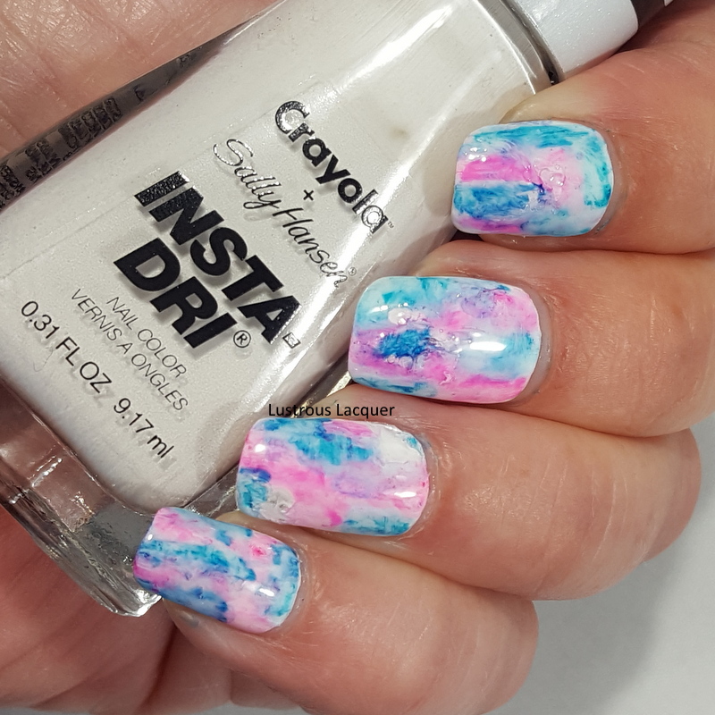
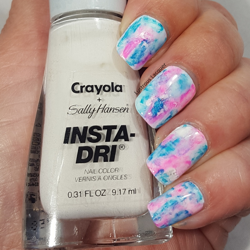
     I recently joined the facebook group Nail Art Collaborative. The Nail Challenge Collaborative is a monthly nail art challenge group free for anyone to join! Each month there is a new theme and the members create 2-4 manis and share with the rest of the group. Even though I've only been a member for two weeks I've been anxious to join in on the fun. The theme for the month of August is Pink & Blue and while I only had time to do one mani, It's one that I really like.


    I started with a base of White from the Sally Hansen Insta-Dri Crayola collab. This is a seriously great white. It covers evenly and had minimal streaking. I know a lot of whites start out awesome and then get goopy as you use them, I'm hoping that's not the case with this one.

     After letting the polish dry completely I added a glossy top coat for strength, and then a matte top coat so the sharpies had something to stick to.


    To create the marbled effect I randomly drew patches on my nails with sharpie markers. I went one nail at a time since I didn't know how quickly the marker would dry. Once I was happy with the patches I dipped a nail art brush into acetone and dabbed it onto the nails which caused the marker to spread and bleed. At first, I tried rubbing alcohol but it didn't seem to have any effect on the marker. That could be because my bottle of rubbing alcohol is only 50%.

     You can repeat this step until you get the look that you like, just remember to let the acetone evaporate off your nails completely before going back in with the sharpie. I was a little impatient and found out the hard way that even a small amount of acetone will dry out your sharpie.


   I really like the way this turned out but as I looked at it I had the strong urge to add some nail art. Nothing too extravagant, I didn't want to take away from the marble base.


     I decided to add some subtle stamping using image plate Creative shop 96 and China Glaze Intelligence, Integrity and Courage and Cosmic Dust as an accent.


     I really expected Cosmic Dust to be a bit darker and was hoping it would stand out more to be a truer accent. I guess when applied thinly like in stamping form it lightens up a bit. The hint of sparkle does add a little something and it isn't over the top like I was wanting.


    What do you think of this sharpie marbled look? Do you like it better with or without the stamping? I had a ton of fun creating this for the August prompt and can't wait to see what the September prompt is. Make sure to check out the other looks from the talented ladies in the group and be sure to stop back next Tuesday for letter R week in the Untried A-Z Challenge. Thanks for stopping by and Happy Polishing!


Tuesday, July 17, 2018

6:00 AM

1850 Polish - Dichotomy


     Ever since their debut in December of 2017 1850 Artisan polish has been taking the indie world by storm. While there have been several memorable releases including a stunning topper collection packed with flakies, today I'll be showing you one of the original polishes, Dichotomy.

     Dichotomy is scattered holographic thermal polish that shifts from a deep purple when cold to a pale lilac when warm. 


     The application is absolutely luxurious with a super smooth formula and a much higher opacity than expected. When applied the color is in the cold state and appeared to have full opacity after the first coat. I used two coats to make sure of full opacity no matter what stage this polish was in. Shown here is two coats plus top coat. 


    For the accent nail, I wanted a stamped image that seemed to appear and disappear depending on the temperature. I used Sinful Colors Forbitten Fruit and an image from Creative shop 23. Forbitten Fruit isn't an exact match but it wasn't as obvious in the cold state as my camera shows. 


    I absolutely loved wearing this manicure and got a kick out of people noticing that it changed colors. I wore this for a full week wild I was camping and came home with only minimal chipping and tip wear. For the conditions I put my hands through that week, I'm very impressed with this polish.  

      How do you feel about thermal manicures with "disappearing" designs? Have you tried this brand yet? I also picked up Duplicity which is another thermal polish and can't wait to try it. Be sure to stop back on Thursday for my review on Sparrow from Poetry Cowgirl, until then, Thanks for stopping by and Happy Polishing! 

Thursday, July 12, 2018

6:00 AM

Gradiated Foliage Nail Art


    I think it's about time I show a little nail art around here, how about you? I know we all like to see swatches of pretty colors but nail art is what really drives me. For today I've gone for a look inspired by my recent camping trip and all the green trees that surrounded us. And will be surrounding us again this weekend as I head out for another adventure. I've gotten my camper all cleaned out since my last post and now I've moved on to packing it up.


      I started with a base of Color Club Super Natural from the newly released Halo Hues collection found at Walmart. For my gradient, I used Lemming Lacquer You're Standing on My Neck which was released in the Polish Pick Up 1990's theme from May of this year and Color Club Super Natural.


    The original look had Super Natural going all the way to my tips, which looked nice. At the last minute, I sponged a bit of You're Standing on My Neck to the tip of my ring finger as an accent. AS soon as I did that I knew I wanted the rest of my nails that way.


     I really like the way Super Natural gives an illuminated effect to the center of the design. It's almost as if the sunlight is reflecting off the center of the leaves. 


    The stamping I did with Hot the Bottle A Glint of Gold and Creative Shop plate #96. I actually had three other colors picked out to stamp with. Black, White, and Silver. But I quickly put those aside for the gold and I think I made the right choice. The black and white would have been too harsh and the silver too subtle. What do you think, did I make the right color choice for my stamping?


    And because I have the need to matte everything these days I had to show you both versions. MY go to matte top coat is currently Matterial Girl from Blush Lacquer. Which I happened to help name. It's my first time naming a polish and I'm still a bit giddy about it!


    So which version do you like better, glassy or matte? Have you found the Halo hues collection this year and are you thinking about picking up a few colors? I've got to get back to packing but Thanks for stopping by and Happy Polishing! 


Tuesday, June 12, 2018

10:54 AM

Untried A-Z Challenge Letter L


     It was just a few days ago when I shared my letter K polish for the Untried A-Z Challenge and here it is, time for my letter L polish. I guess that's what happens when you get behind on blogging! So here is my Untried A-Z Challenge letter L polish, enjoy!


     Since it's summertime and been abnormally hot here lately I chose to go with a bright shade this week. And there's no better way to go bright than with a neon polish. Or in this case a Not Really Neon. Check out Lemonade from the Not Really Neon's Collection released last summer from Polish 'M.

Neon yellow nail polish with a creme finish

     Lemonade is a bright lemon yellow creme polish. Typically yellow is a hard color for me to wear but I actually like this one. It's so fun and bright plus it makes me look like I have a nice tan. Any polish that makes my tan look better gets bonus points from me. 

     
     Like most neons Lemonade applied a bit streaky on the first coat, thankfully it's a self-leveling polish so the streaks weren't a major issue. This polish builds up nicely on the second coat and I probably could have stopped there if I'd used white undies. I had a few places on my nails that appeared to be patchy so I opted to use 3 coats. Shown here is 3 coats plus a matte top coat. 


     Lemonade dries very quickly and with a matte finish. Just what I would expect from a neon polish. Like I mentioned above I like this polish and would probably wear it on its own in the future. But for this post, I opted to add a little nail art to the mix.


    For this marbled look, I used Creative Shop plate 31 and stamping polishes Straight Up Black and Bami White from Bundle Monster and Slate Stamping Sauce from Sassy Sauce Polish. 


    The completed look is a bit much for me but I do really like how my middle finger turned out. In this case, less is more and I'll have to keep that in mind in the future. And as you can see once again I was inpatient when applying my top coat and smeared my pinky finger terribly. 


     What are your thoughts on yellow polish? Is it a color you can easily wear? If you'd like to join in on the Untried A-Z challenge we will be staring letter M week on June 25th and ending on the 29th. Thanks for stopping by and Happy Polishing!


Thursday, March 1, 2018

6:00 AM

Heather's Hues You've Got to be Shiftin' Me Encore Duo


     Welcome back to Heather's Hues week! This time I'm bringing you the final installment of the You've Got to be Shiftin' Me series. The Encore Duo consists of two shifty and opaque polishes. If you missed the first two installments not to worry, I've got you covered. You can follow these links to see my reviews of the You've Got to be Shiftin' Me collection and the You've Got to be Shiftin' Me Collection part deux. Just like those previous posts I've shown this duo on four full fingers and then stamped on one nail with creative shop plate 14 over a black base.

Glow

An aqua to green shifting multi-chrome nail polish

     Color: An aqua to green shifting multi-chrome nail polish. 

     Application: Smooth application with an even coverage and very opaque. Shown as one coat plus top coat. Out of the entire series, this polish has the most subtle shift. Sadly the shift is more evident in my photos than I could actually see on my nails. 

An aqua to green shifting multi-chrome nail polish

An aqua to green shifting multi-chrome nail polish

Dazzle

A purple to pink multi-chrome nail polish with flashes of gold and green.

     Color: A purple to pink multi-chrome nail polish with flashes of gold and green. 

     Application: Smooth even application with a high opacity. Shown as one coat plus top coat. Dazzle does dry with a few brushstrokes but they are minimal and the color shift makes them less evident to the naked eye. 

A purple to pink multi-chrome nail polish with flashes of gold and green.

A purple to pink multi-chrome nail polish with flashes of gold and green.

     That rounds out the You've Got to be Shiftin' Me series of polishes from Heather's Hues. Just like part deux at the time of this post, the encore duo is not currently available for purchase and there are no immediate plans to bring it back to the shop. That being said I hope you still enjoyed this duo. Thanks for stopping by and Happy Polishing! 

Tuesday, February 27, 2018

6:00 AM

Heather's Hues You've Got to be Shiftin' Me part deux


     Welcome to Heather's Hues week on the blog! Almost a year ago I reviewed the You've Got to be Shiftin' Me collection a very opaque super shifty collection of polishes. I liked that collection so much that when the second installment was offered I knew I needed wanted to get them. I have to say that purchasing these was a very good idea. This four color collection is equally as beautiful as it's predecessor and is just as opaque.

     Just like the first collection I've shown each color on 4 nails and stamped on one nail using creative shop plate 14 over a black base to show just how opaque and versatile these polishes are.

Spangle

A green to gold shifting multi-chrome polish with flashes of orange

     Color: A green to gold shifting multi-chrome polish with flashes of orange.

     Application: Spangle is a very opaque nail polish with even application. It does dry with a few brushstrokes but my camera seems to have magnified them as they were less visible to the naked eye. Shown here as one coat plus top coat. 

A green to gold shifting multi-chrome polish with flashes of orange

A green to gold shifting multi-chrome polish with flashes of orange

Coruscate

A purple to blue shifting multi-chrome nail polish with flashes of magenta and orange.

     Color: A purple to blue shifting multi-chrome nail polish with flashes of magenta and orange. 

     Application: Very opaque nail polish but I had a slight issue with dragging when using multiple strokes on the same nail. The application wasn't quite as even as spangle but was still pretty easy to work with. Shown here as one coat plus top coat. Coruscate does dry with a few brushstrokes but there are minimal. 

A purple to blue shifting multi-chrome nail polish with flashes of magenta and orange.

A purple to blue shifting multi-chrome nail polish with flashes of magenta and orange.

Lustre

A purple to gold multi-chrome nail polish with hints of orange.

     Color: A purple to gold multi-chrome nail polish with hints of orange.

     Application: Smooth even formula with a nice application. Once again this polish is extremely opaque. Shown as one coat plus top coat. This polish does dry with a few brushstrokes and the lighter shade makes them more obvious than with the other colors in the collection. 

A purple to gold multi-chrome nail polish with hints of orange.

A purple to gold multi-chrome nail polish with hints of orange.

Blaze

A magenta to purple shifting multi-chrome with flashes of orange and gold.

     Color: A magenta to purple shifting multi-chrome with flashes of orange and gold. 

     Application: Just like this rest of this collection Blaze is very opaque with a nice even formula. Shown here as one coat plus top coat. 

A magenta to purple shifting multi-chrome with flashes of orange and gold.

A magenta to purple shifting multi-chrome with flashes of orange and gold.

     At this time the You've Got to be Shiftin' Me part Deux collection is not available and when I asked Heather she had no immediate plans to bring it back to the shop but did not rule out the possibility of a return down the road. Do you have a favorite from this collection? I'll be back on Thursday to bring you the third and final installment in the You've got to be Shiftin' Me series. Thanks for stopping by and Happy Polishing!

Wednesday, March 22, 2017

6:00 AM

Heathers Hues - You've Got To Be Shiftin' Me Collection

*Nothing to Disclose*

     Today I have a gorgeous multi-chrome collection from Heathers Hues to share with you. The You've Got to be Shiftin' Me limited edition collection is currently in it's 2nd pre-order which runs from March 17th through April 3rd. Yes I know I'm getting this post up late. Forgive me, I'm on my second week of vacation and for some reason when I have extra time on my hands I'm very unproductive. Always pushing tasks back thinking I have time to complete them after I do 6 other little things. I actually do my best work and am the most productive when I have a limited timeline. Crazy I know but it's just how I'm wired. Anyway back to the polish.....

      The You've got to be Shiftin' Me Collection consists of 4 polishes and I've got a ton of photos to share with you. Because of all the photos and consistent formula throughout the entire collection, I thought one quick paragraph on the application was the best way to go.

     All photos are shown as 2 coats plus a top coat, except for the stamped images. Those are shown as 2 layers of a black base, top coat, stamped image and another layer of top coat. Each polish has a highly pigmented base and smooth, even application. For the stamped images I used Creative Shop plate #14. And yes each and every one of these stamp beautifully.

Vibrance


     Vibrance is a multi-chrome polish that shifts from vibrant magenta to lime green to shimmery copper and yellow gold.


Scintillate


     Scintillate is an intense multi-chrome that shifts from ocean blue to tropical teal to royal purple. I also saw hints of pink and gold depending on the angle and lighting. 


Lurid


     Lurid is a multi-chrome that shifts from emerald green to tropical teal to soft rose with flashes of purple. For me, I saw mainly a shift from emerald green to lime green and hints of purple. 


Luminous


     Luminous is a multi-chrome that has an intense shift from vivid violet to bluebonnet blue to blush pink to amber orange and a coppery gold. I thought this would be my favorite from the collection because of the rainbow of colors. But it's actually my 3rd favorite. 


     While I love all 4 colors from this collection I have to say that my top two are Vibrance and Scintillate because they showed the most color shift when stamped. Although Luminous is a close 3rd. Which one is your favorite?

     The You've Got to Be Shiftin' Me collection can be purchased as a full set or individual bottles in both full size and mini (I purchased the mini set) and will not be rereleased after this pre-order. So if you want them go get them now. As always thanks for stopping by and Happy Polishing!

Like what you see? Share it with your friends!