| |||||||||||||||||||||||||
|
Friday, August 31, 2018


Thursday, August 30, 2018
I recently joined the facebook group Nail Art Collaborative. The Nail Challenge Collaborative is a monthly nail art challenge group free for anyone to join! Each month there is a new theme and the members create 2-4 manis and share with the rest of the group. Even though I've only been a member for two weeks I've been anxious to join in on the fun. The theme for the month of August is Pink & Blue and while I only had time to do one mani, It's one that I really like.

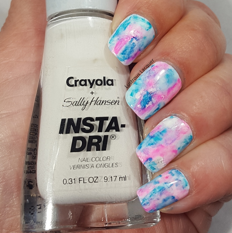
I started with a base of White from the Sally Hansen Insta-Dri Crayola collab. This is a seriously great white. It covers evenly and had minimal streaking. I know a lot of whites start out awesome and then get goopy as you use them, I'm hoping that's not the case with this one.
After letting the polish dry completely I added a glossy top coat for strength, and then a matte top coat so the sharpies had something to stick to.

To create the marbled effect I randomly drew patches on my nails with sharpie markers. I went one nail at a time since I didn't know how quickly the marker would dry. Once I was happy with the patches I dipped a nail art brush into acetone and dabbed it onto the nails which caused the marker to spread and bleed. At first, I tried rubbing alcohol but it didn't seem to have any effect on the marker. That could be because my bottle of rubbing alcohol is only 50%.
You can repeat this step until you get the look that you like, just remember to let the acetone evaporate off your nails completely before going back in with the sharpie. I was a little impatient and found out the hard way that even a small amount of acetone will dry out your sharpie.

I really like the way this turned out but as I looked at it I had the strong urge to add some nail art. Nothing too extravagant, I didn't want to take away from the marble base.

I decided to add some subtle stamping using image plate Creative shop 96 and China Glaze Intelligence, Integrity and Courage and Cosmic Dust as an accent.

I really expected Cosmic Dust to be a bit darker and was hoping it would stand out more to be a truer accent. I guess when applied thinly like in stamping form it lightens up a bit. The hint of sparkle does add a little something and it isn't over the top like I was wanting.

What do you think of this sharpie marbled look? Do you like it better with or without the stamping? I had a ton of fun creating this for the August prompt and can't wait to see what the September prompt is. Make sure to check out the other looks from the talented ladies in the group and be sure to stop back next Tuesday for letter R week in the Untried A-Z Challenge. Thanks for stopping by and Happy Polishing!
I started with a base of White from the Sally Hansen Insta-Dri Crayola collab. This is a seriously great white. It covers evenly and had minimal streaking. I know a lot of whites start out awesome and then get goopy as you use them, I'm hoping that's not the case with this one.
After letting the polish dry completely I added a glossy top coat for strength, and then a matte top coat so the sharpies had something to stick to.
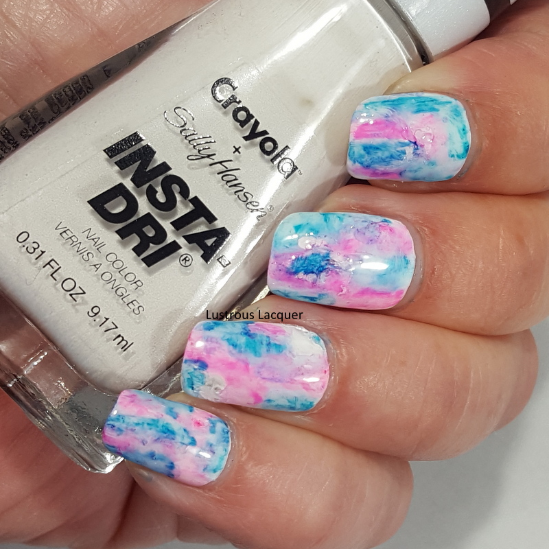
To create the marbled effect I randomly drew patches on my nails with sharpie markers. I went one nail at a time since I didn't know how quickly the marker would dry. Once I was happy with the patches I dipped a nail art brush into acetone and dabbed it onto the nails which caused the marker to spread and bleed. At first, I tried rubbing alcohol but it didn't seem to have any effect on the marker. That could be because my bottle of rubbing alcohol is only 50%.
You can repeat this step until you get the look that you like, just remember to let the acetone evaporate off your nails completely before going back in with the sharpie. I was a little impatient and found out the hard way that even a small amount of acetone will dry out your sharpie.

I really like the way this turned out but as I looked at it I had the strong urge to add some nail art. Nothing too extravagant, I didn't want to take away from the marble base.

I decided to add some subtle stamping using image plate Creative shop 96 and China Glaze Intelligence, Integrity and Courage and Cosmic Dust as an accent.

I really expected Cosmic Dust to be a bit darker and was hoping it would stand out more to be a truer accent. I guess when applied thinly like in stamping form it lightens up a bit. The hint of sparkle does add a little something and it isn't over the top like I was wanting.

What do you think of this sharpie marbled look? Do you like it better with or without the stamping? I had a ton of fun creating this for the August prompt and can't wait to see what the September prompt is. Make sure to check out the other looks from the talented ladies in the group and be sure to stop back next Tuesday for letter R week in the Untried A-Z Challenge. Thanks for stopping by and Happy Polishing!
Tuesday, August 28, 2018
I recently stumbled upon a new collection from Sinful Colors at my local Walgreens and of course, had to snatch it right up. I then went home to look up the new collection on their website. What did I find? Absolutely nothing, there is no mention of this new Radical Mattes Collection on their website or social media channels. Huh, I wonder if my store put them out too early? Lucky me I guess!
Anyway, I'm going to go ahead and assume that this is their Back to School collection for 2018 and will update the post if I find out otherwise. This collection consists of 7 matte finish cremes and a matte top coat. Now I have to say that in my opinion, this isn't a matte collection, especially compared to the Wild at Heart collection from the summer. The Wild at Heart Collection dried to what I consider a true matte finish while this new collection dries to a rubbery semi-matte finish. In fact, the finish on these reminds me of the Full Throttle collection from 2014. Even the matte top coat dries a bit more rubbery than a traditional matte finish but is closer than the polishes in this collection.
All polishes are shown as 2 coats plus the Sinful Colors matte top coat and photographed in my lightbox using daylight light bulbs.
Brave

Color: A rusty orange creme nail polish with a semi-matte finish
Application: The formula on this is a bit thicker than I'm used to but still easy to work with. Because of the thicker formula, the polish is very opaque but wanted to apply a bit streaky but not enough to leave bare spots on the nail. So it was almost more like ridges then steaks. Thankfully this polish self-levels so you are left with a smooth finish.


I think this is an interesting color, it's not one that I would typically reach for and I'm not 100% sure I will actually wear it again. The opacity makes me wonder if it would work well for stamping, and the thickness makes me question if it would watermarble.
Defiant

Color: A dusty lavender creme nail polish with a semi-matte finish.
Application: The formula for Defiant is an exact copy to that of Brave. The polish is thicker but easy to work with, again I had issues with the ridge/streaks, and the polish self-levels. The is a beautiful opacity to this that makes me want to try and stamp with it.


I find that I actually like this color. I would easily wear it again and use it as a base for nail art. Like I mentioned that high opacity makes me want to try stamping with it, I can see it working for those images with intricate designs to them. Sadly my macro shot made this polish lean more to the blue side, but I assure you it looks just like my full hand images.
Fearless

Color: A dark berry pink creme nail polish with a semi-matte finish.
Application: Fearless has the highest opacity of this collection and could be considered a one coater. I found that I didn't have the issue of steaks/ridges during application with this one which was a pleasant surprise. I didn't wear this one for long but did find that it wanted to stain my skin during removal so I would highly recommend a good base coat when wearing this. Thankfully I was able to avoid any stains on my nails.


I am a sucker for pink nail polish and this one is a must have for me for fall. It also makes me a bit nostalgic for my high school years because I used to have scented candles all over my room that were almost this exact color. Anyone else?
Rebel Yell

Color: Bright red creme nail polish with a semi-matte finish. This one actually looked a little less like a traditional red when I was wearing it, almost like it had a berry tone to it. (think strawberries) My camera makes it lean a bit more true red than what my eyes saw.
Application: Another highly pigments polish with nice opacity. If I had to guess I'd say this one will be a stainer also so make sure to use a good base coat. The formula on this one is again thicker and wanted to apply with those same pesky streaks/ridges. Again this polish self-levels so a smooth, even finish is not a problem


Red nail polish is a classic for me, and I do like this color. I found myself wanting to add nail art to it rather than wear it alone though. I think if I'd added a glossy top coat I would easily wear this one alone.
Renegade

Color: Brown leather creme nail polish with a semi-matte finish.
Application: This polish has the thinnest formula of the collection. I did have issues with traditional streaks and this polish does not self-level. A second coat evens everything out and gives full opacity.


Honestly, this is not a color for me. It's too dark for my taste when it comes to plain polish. I am going to keep it though because I have a feeling ti will come in handy for nail art or could look nice with a topper.
Roar

Color: A sky bly creme nail polish with a semi-matte finish.
Application: Another highly pigmented polish with a great opacity. This one applied without streaks and gave even coverage. Like all blue polishes, I'm leery of staining so make sure to use a good base coat.


I think this color belongs with the other colors in this collection and it is a nice blue, but not one that's really for me. At least not on its own. Maybe as an accent nail, under a topper or used in nail art, but not alone. I do like how opaque it is which will come in handy if I try to stamp with it.
Rise Up

Color: A pale blue creme polish with a semi-matte finish. I'd call this "It's a Boy Blue"
Application: The formula on this one was a bit like Renegade but not quite as thin. I did have an issue with streaking and the polish not wanting to self-level but it wasn't too bad. Just a few streaks here and there. Application of a second coat evens everything out for a smooth finish.


I feel like this color is the odd one out for the collection. All the others have a nice rich tone to them and then this one is a pastel. I do like this blue a bit better than Roar but again I'm not sure if I would wear it alone.
Overall I like the potential for versatility this collection has with the highly pigmented colors and am anxious to see how they will work for stamping. The colors do have an Autumnal feeling to them for me with the exception of Rise Up. Are they colors I will wear again? That's about 50/50.
If you're looking for this collection I have heard it's starting to pop up in stores around the U.S. Hopefully Sinful Colors will have some information on it up on their site soon and it will be available nationwide. I know I'm getting kind of tired of searching all over for the latest collections, driving up to an hour away because someone spotted it on shelves in another town.
Sinful Colors if you're reading this please stop picking and choosing which stores/markets get the collections and have them be available to those of us who want to purchase them. I know the 5 stores within 30 minutes of my home never received The Indie Sol or Boho Beat collections this spring. Don't you want my money?
Ok, I'm done with my little rant. I hope you enjoyed today's post. Let me know what your favorite color from this collection is in the comments and as always, Thanks for stopping by and Happy Polishing!
Sunday, August 26, 2018


Friday, August 24, 2018


Thursday, August 23, 2018
With summer vacation coming to an end I've found myself leaning more towards the darker, muted shades of fall. Don't worry I haven't put away all my fun bright colors I've just tucked them away for today to bring you Aubrey from Zoya with a fun glitter accent nail thrown in.

This is actually the manicure I wore when I went on a paranormal investigation at the beginning of the month. I've been a big fan of the paranormal tv shows for a long time but they can come off as pretty fake and I've always been open to the possibility that ghosts and spirits exist so when a co-worker invited me to go along with them two years ago I jumped at the chance. I want to have one of those experiences where you know 100% it was real, where you can't debunk it as a building shifting, or bugs caught in the camera flash. Here's a photo I tool overlooking the gymnasium at the old school we just investigated. Did I catch orbs on film?

I have gone on 4 overnight investigations in the last two years and we are already making plans for our next one, which I am excited for. You could say I'm just as hooked on doing these investigations as I am on nail polish. But you are here for the polish so let's get back to that.
I think Zoya Aubrey was a great color to highlight the brown tones in the glitter while also adding a little hint of color. Not to mention the fact that these types of colors have been calling my name since mid-July. The formula was great just like I've come to expect from Zoya.

My accent nail is done in a loose glitter mix from Glittertastrophe called But First Coffee. A blend of cream, mocha, browns, and espresso glitters in a range of sizes from large hex to extra fine glitter.
The application was extremely easy. I painted on a layer of Orly Bonder and once it dried to a tacky consistency I simply dipped my finger into the glitter pot. I repeated this process twice to get complete coverage. While this way worked out beautifully I think the next time I will use an eye-shadow applicator to dab it onto my nail.

Because I ended up with so much glitter on my nail there was a ton of texture that even two thick layers of top coat couldn't smooth out. That's another reason I think I'll go with the applicator method the next time. But I am open to any tips or tricks you might have for applying loose glitter.
If you are a fan of loose glitter I highly suggest checking out Glittertastrophe. The prices are extremely reasonable and the shipping was extremely quick. Thanks for stopping by and Happy Polishing!
Tuesday, August 21, 2018
Back to school season is in full swing at my house. I'm back to work, training for the new school year and picking up those last minute items my kids will need for the start of theirs. But that doesn't mean blogging get to take a back burner so I'm back today with the next letter in the Untried A- Z challenge.

It's not easy finding a brand name or polish name starting with the letter Q but I managed to find one to share with you today from my untried pile. Queen of Beauty from SinfulColors.
Sinful Colors is known for releasing limited edition glitter toppers for seasonal collections, but they are also known for re-releasing those toppers a year or two later for another seasonal collection. That just happens to be the case with the topper I'm sharing today so if you like it, keep your eyes open, it should be on shelves again. For the polish I'm sharing today I used a base of Black on Black which gave me full coverage with one coat.

First up is Queen of Beauty. A clear based polish with mini silver hex glitter. Now while I can't remember the original collection this was released in, I do know it originally came out in 2015 but popped back up last year for a St. Patricks Day collection.

I was pleasantly surprised at the formula, I expected the need to sponge on the second layer in order to get good glitter coverage but that was not the case. In just one coat I was able to get a generous amount of glitter on the nail. There were no issues with the glitter wanting to slide to the tip of my nail and every single one lays completely flat. This polish also dries without a hint of texture from the glitter. Shown here as 1 coat over black and a glossy top coat.

My overall thoughts are that I really like this polish for formula and ease of application. I like that the silver glitter is a true silver and would look great over a variety of colors. Using this in a full mani might be overkill unless some stamping or hand-painted nail art was layered over it. It also has the potential as an accent nail, especially for those holiday manicure we all love to create.
What are your thoughts on glitter toppers? Are they still on trend or have they seen their day? There's still plenty of time to join in the untried A-Z Challenge for the letter Q or join us in two weeks for letter R week. Thanks for stopping by and Happy Polishing!